Wild Earth
Logo & Wordmark
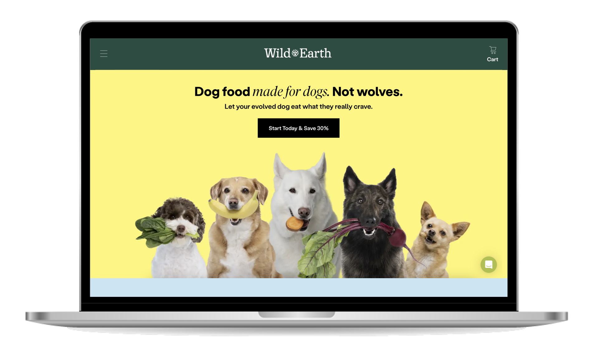
WILDEARTH.COM
This One’s for the Doggos. 🐕
Wild Earth, a business with big ideas about natural, scientific, plant-based dog food, came to us in somewhat full form already, except for one thing — a wordmark. They had developed a dynamic brand platform and aesthetic already, but knew their wordmark and logo just wasn’t cutting it. Our mandate was clear: find a way to pull together the brand personality, strategy, energy, and assets into a single wordmark and logo symbol that could lead the pack. What we ended up with, through a whirlwind collaboration, is a strong, clear, ownable statement for a brand that means a lot to us humans, but perhaps more importantly, means a lot to the pups that benefit from it all.
Wordmark
We knew from the outset that we wanted to wordmark to exemplify the psychology of the brand itself—a combination of smart science and organic energy. The attitude had to be approachable but smart, familiar yet novel, and sturdy yet flexible. We developed a mixed-case book-smart serif letter style that could fit right in with the existing colorful brand assets but stand out in the grocery aisle.


Logo
Wild Earth was founded on an intelligently formulated recipe for plant-based dog superfood with ancient koji and compelling flavors that are leading the way forward. Instead of being just a simple shorthand for the brand, the logo needed to be the organic and energetic partner to the wordmark’s clean look, completing the one-two paw pairing that makes this identity shine.
Lockups
The wordmark and logo were designed to play well together. Whether emblazoned at the top of the kibble bag like a magazine masthead, left aligned for tighter spaces, or more free-form for advertising and marketing roles, the lock up is where it all came together.


Kibble


Supplements

Treats


Website
As everyone knows, a logo alone does not a brand make… but they certainly help it find its way home. We have to give a huge shout out the remarkable in-house design team at Wild Earth who took this identity and ran with it. The joy in this project for us was in being a part of this brand finding its cherry on the top of its brand ice cream, er… pup cup.