

Emporium Sans
Custom Type System
One Style, One Weight
A Fine Typeface for Fine Folks
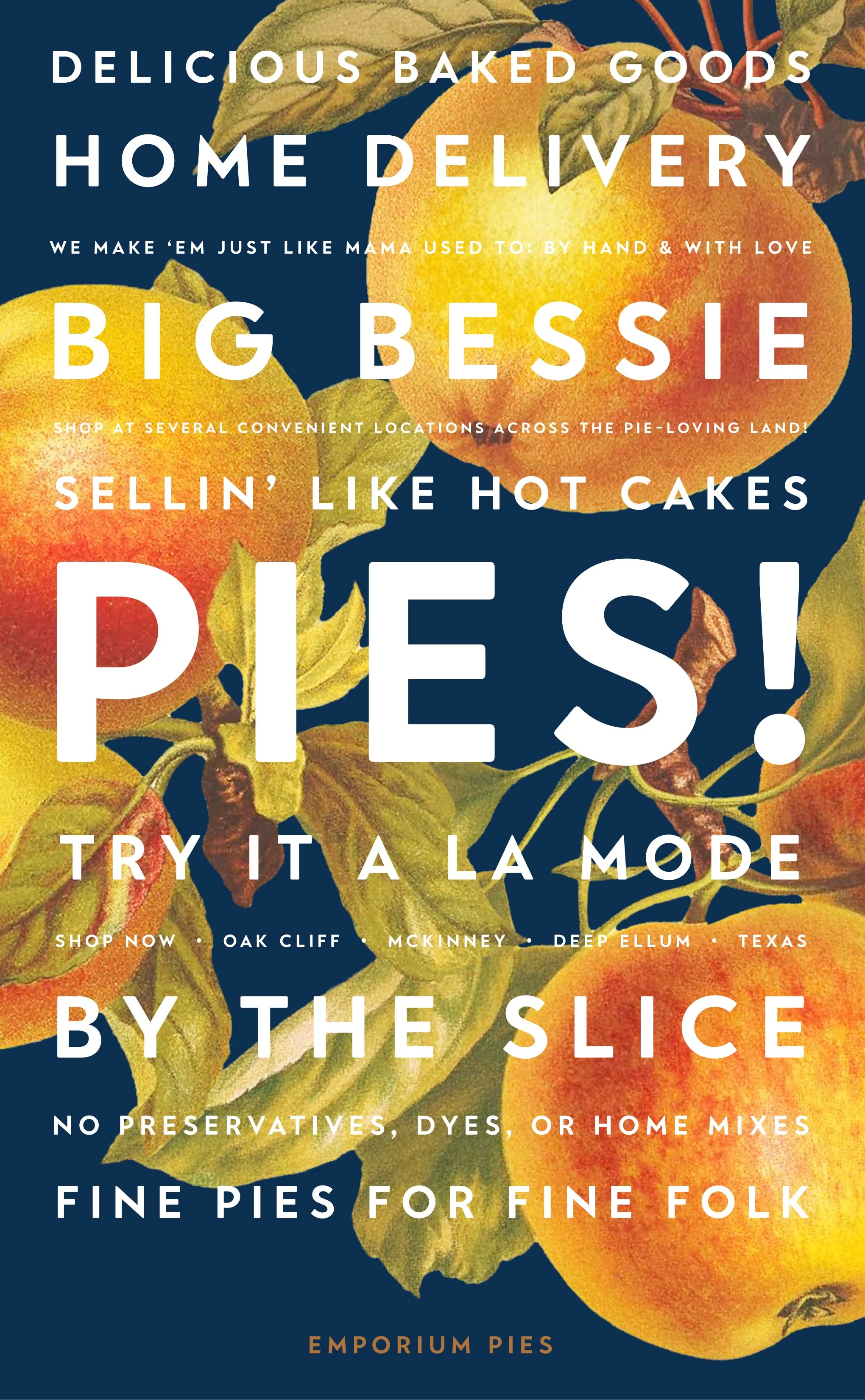
Back in the pandemic days, we got a call from good friends who founded and operate Emporium Pies, a boutique pie shop making a name for itself with delectable pie flavors—spanning from the classics to the imaginative—in the heart of Texas. Although it’s unclear whether it was the locked-down pie fans capitalizing on Emporium’s home delivery option or the warmth and joy that eminates from the founders themselves, sales were growing and it was time to rebrand. We were asked to help create an ownable brand voice by crafting a custom typeface that exemplified their friendly, approachable personality and delicious, flavor-filled pies.
Wordmark
The first step for us was crafting a wordmark. In collaboration with the owners, we shaped and cut all-caps letterforms that gave their name a regal stature, casual approachability, and mouth-watering allure. The M flared, the R stood proud, and the weight was just right — signs we had the perfect recipe to bake a whole new typeface.


Alphabet
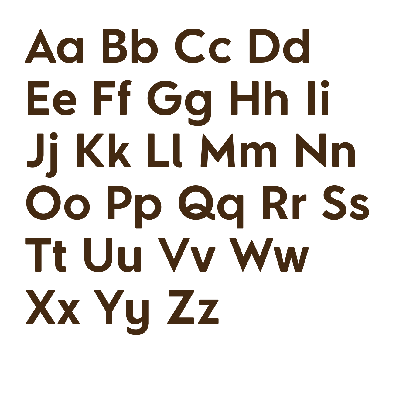

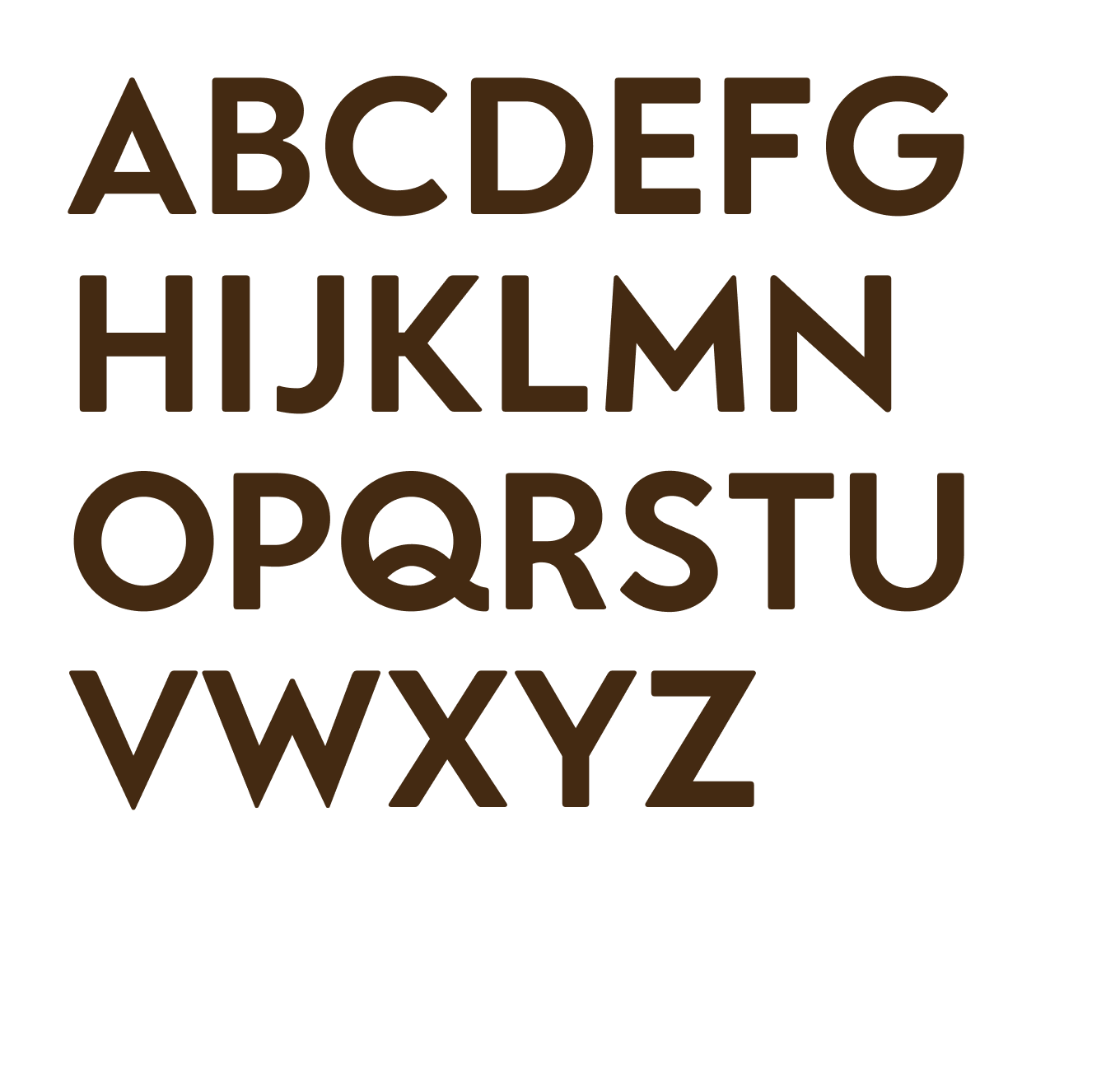

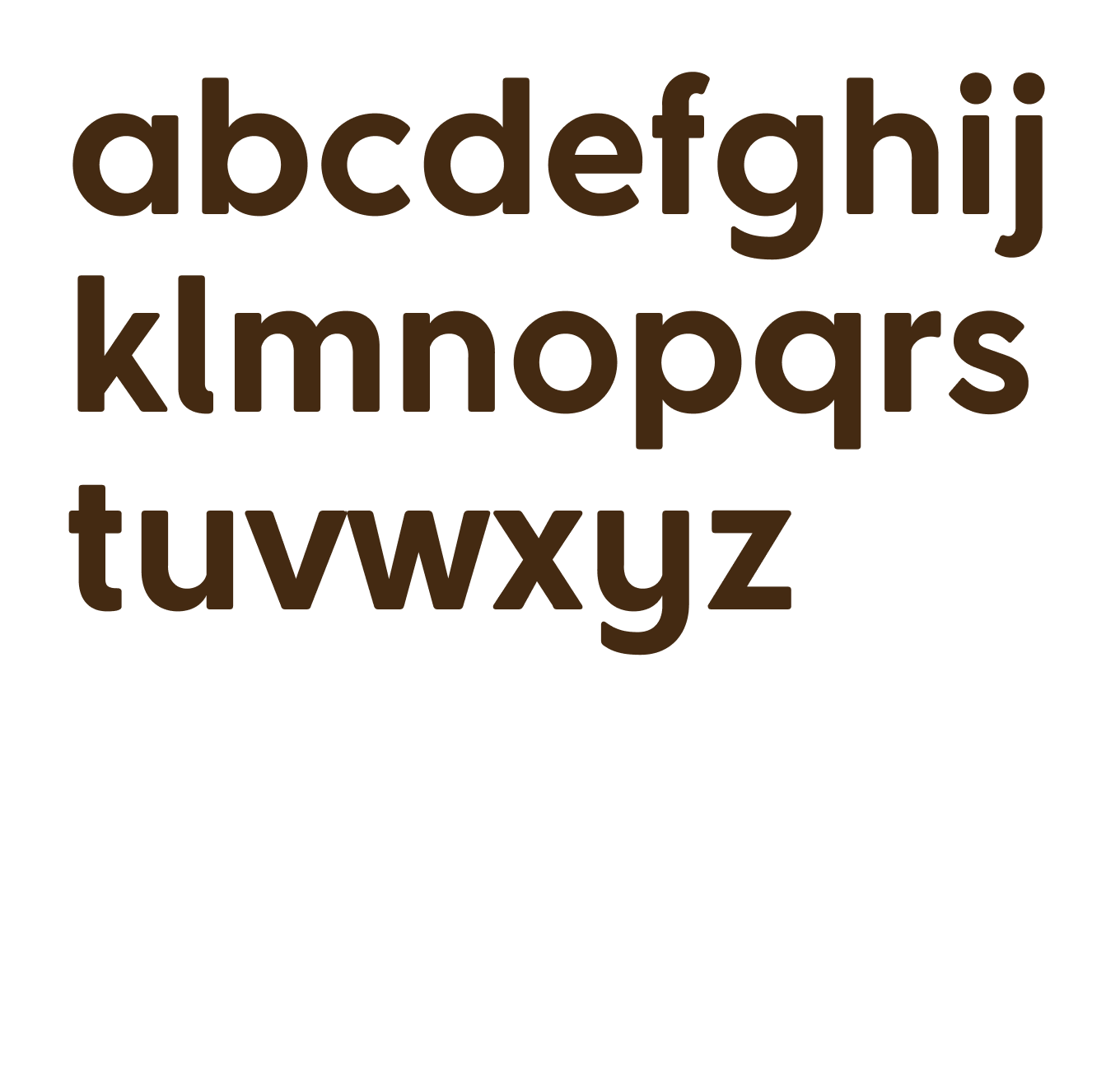

The alphabet came together in the caps first, as this was the brand’s preferred and already established case for typesetting headlines and website wayfinding. The square proportions give the alphabet stability, while the rounded corners take a little edge off. The lower case is where the friendliness truly comes out, confidently inviting all to come share a slice.
Numbers & Punctuation
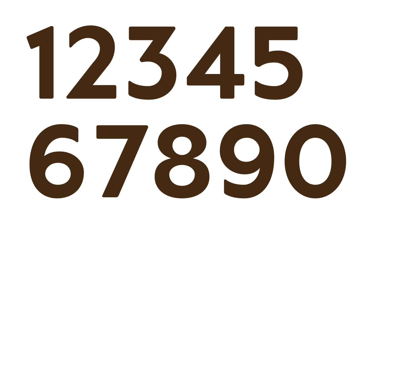

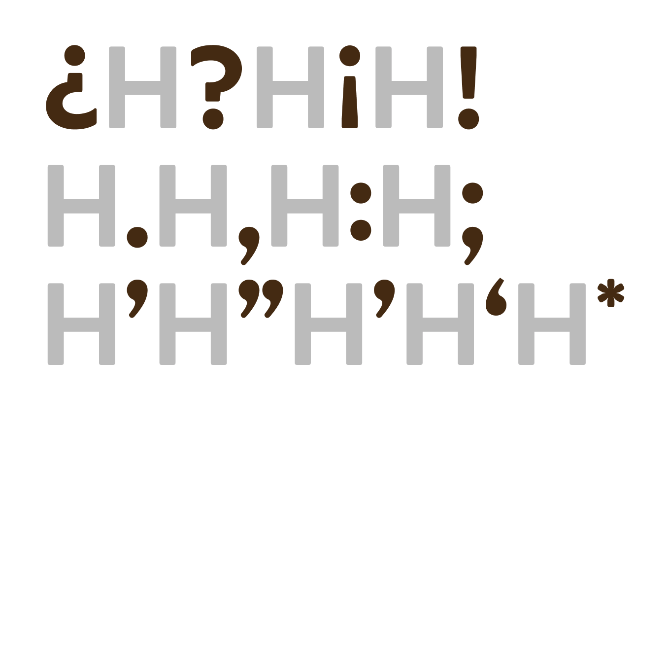


The Numbers are a crucial set for Emporium Sans, as clear communication about pricing, dates, addresses, and times are central to the business’s growing operation. The punctuation followed suit, providing an airy but supportive framework for the alphabetic and numerical glyphs.

Arrows

The arrows are where we got to have a little fun. We thought a little brand activation was needed here, turning the arrows into pie slices! This little touch brought a whole new visual element into play that could be used as delightful wayfinding or cheeky branded icons.
Dingbats

Continuing in the spirit of the pie slice arrows, we thought every brand should have a good set of dingbats. Again, we were inspired by the pies themselves, bringing a set of scalloped crusts to life to be used as playful, decorative borders, bullets, or line elements.
Frames
We couldn’t just stop at arrows and dingbats, either. One of the things we love about typography is its ability to multiply brand value. We developed Emporium Sans to be a creative tool, not just a font to set promo material headlines in. (Although it’s excellent for that.)
This meant a full suite of scalloped edgings to frame any document or message with pie crust. We loved how this was embraced as a lighthearted way to be all about pie anywhere and everywhere, from social media posts to menu highlights.


Text Settings
Emporium Sans was also developed to be used as the brand’s foremost communication tool, and that meant ensuring the typeface looked good at large headline sizes AND small captions and paragraph text. The typeface’s tighter spacing, large counterforms, and strategic ink traps make sure the pies are the only things getting gloopy and gloppy.

Design & Application
Overall, we’re incredibly proud of Emporium Sans and the power it brings to Emporium Pies. Next time you find yourself in Texas, stop into one of their several locations. If you’re nowhere near Texas, get Emporium Sans delivered to your door, it’s a true treat.
