
A Storied Family
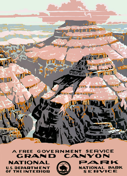
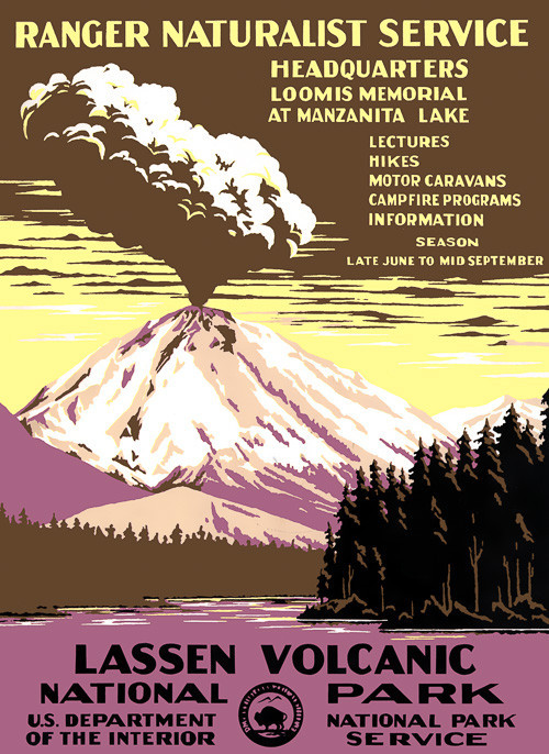
The Ermine Type Family is derived from one of the most illuminated eras in American History. President Franklin D. Roosevelt launched his New Deal in 1929 to get America back to work after the now infamous market crash and Great Depression. Between 1935 and 1943, the Works Progress Administration (WPA) was established by presidential order and employed more than 8 million workers. Some of the more visible projects were posters created to promote tourism in the country's National Parks. More than 2,000,000 posters were printed by the Federal Art Project’s poster division. Almost all of these posters have been lost or destroyed.
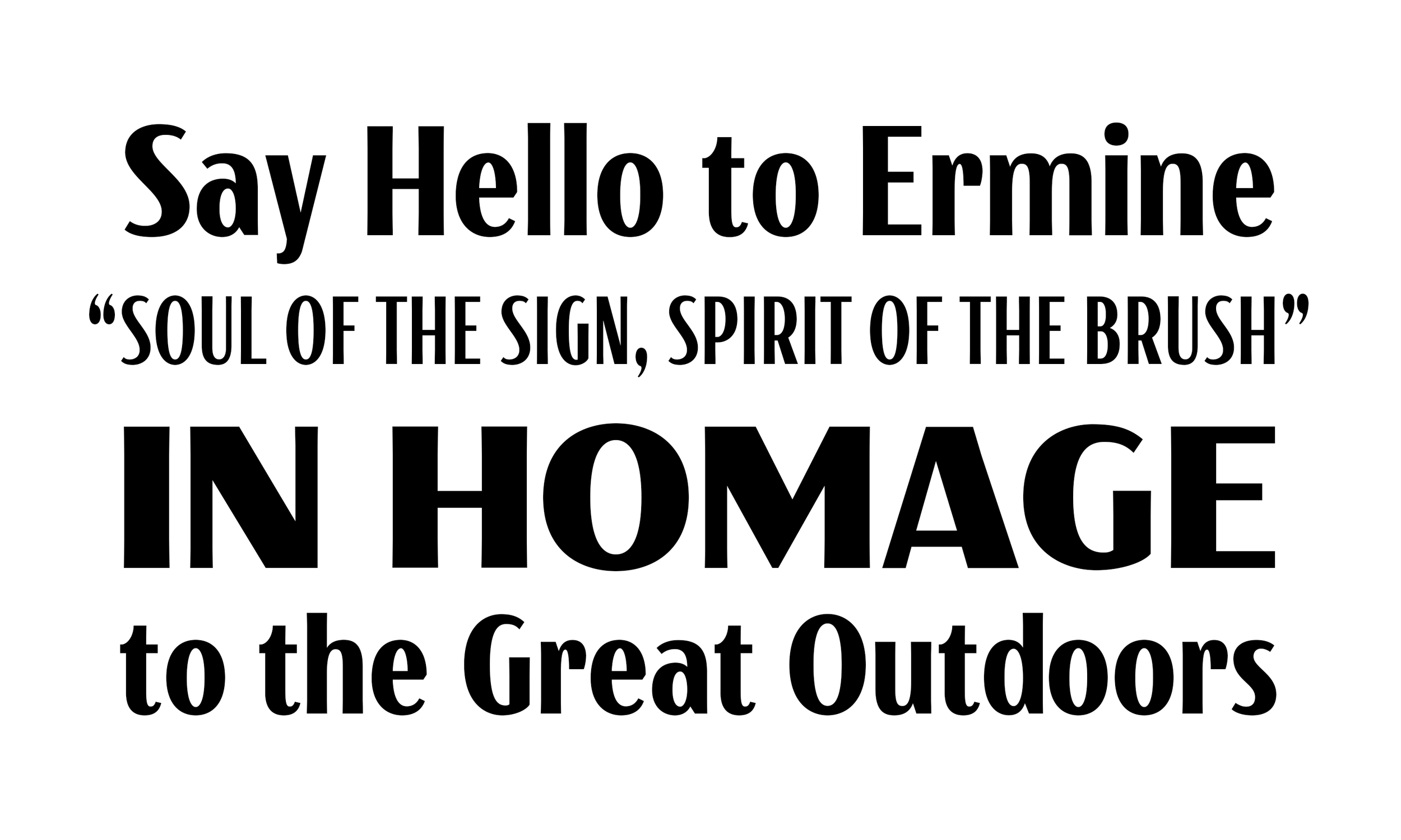
The Ermine Family is designed to be reminiscent of this era of public art, drawing from the wonderfully quirky lettering styles of the WPA National Parks Posters themselves.
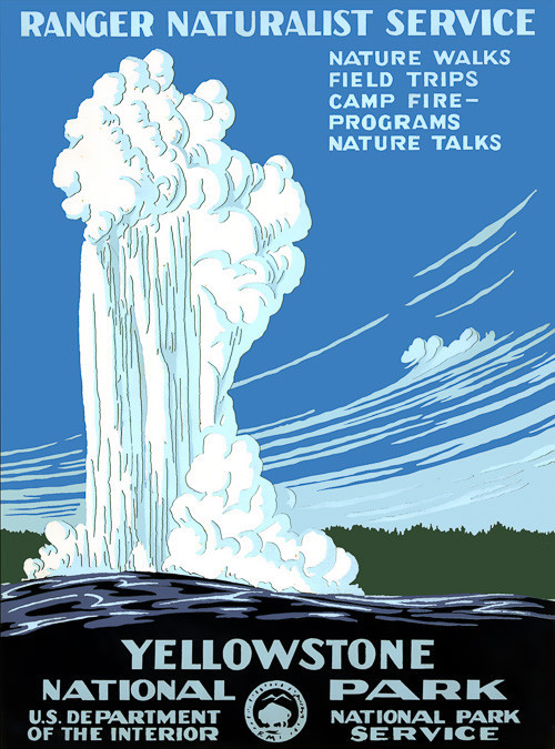
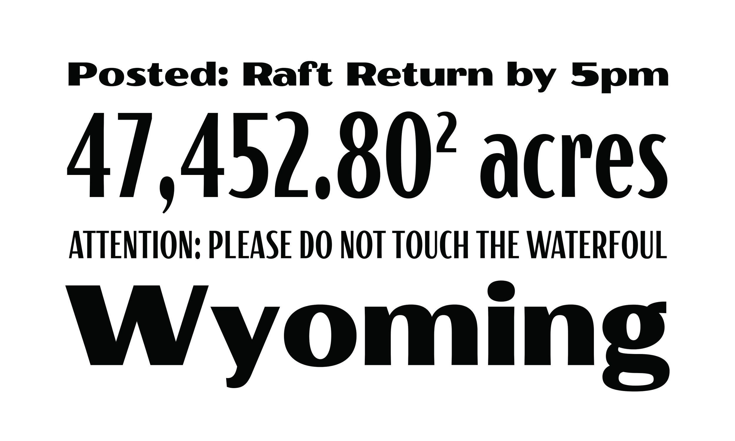
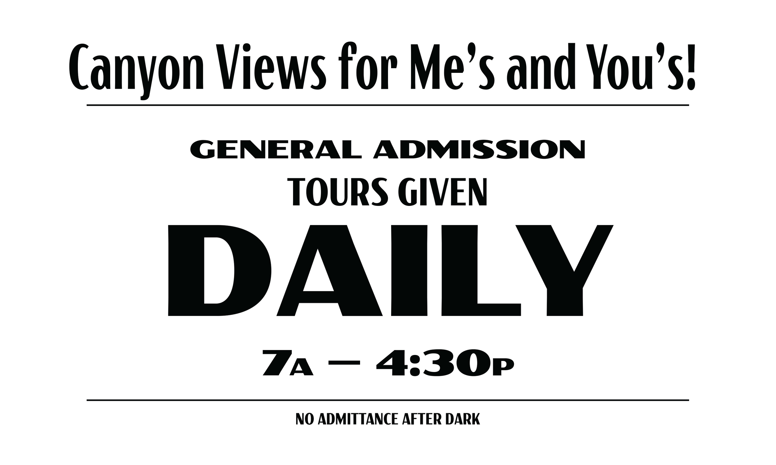
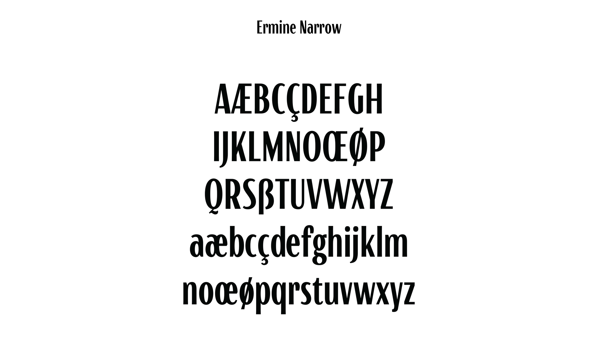
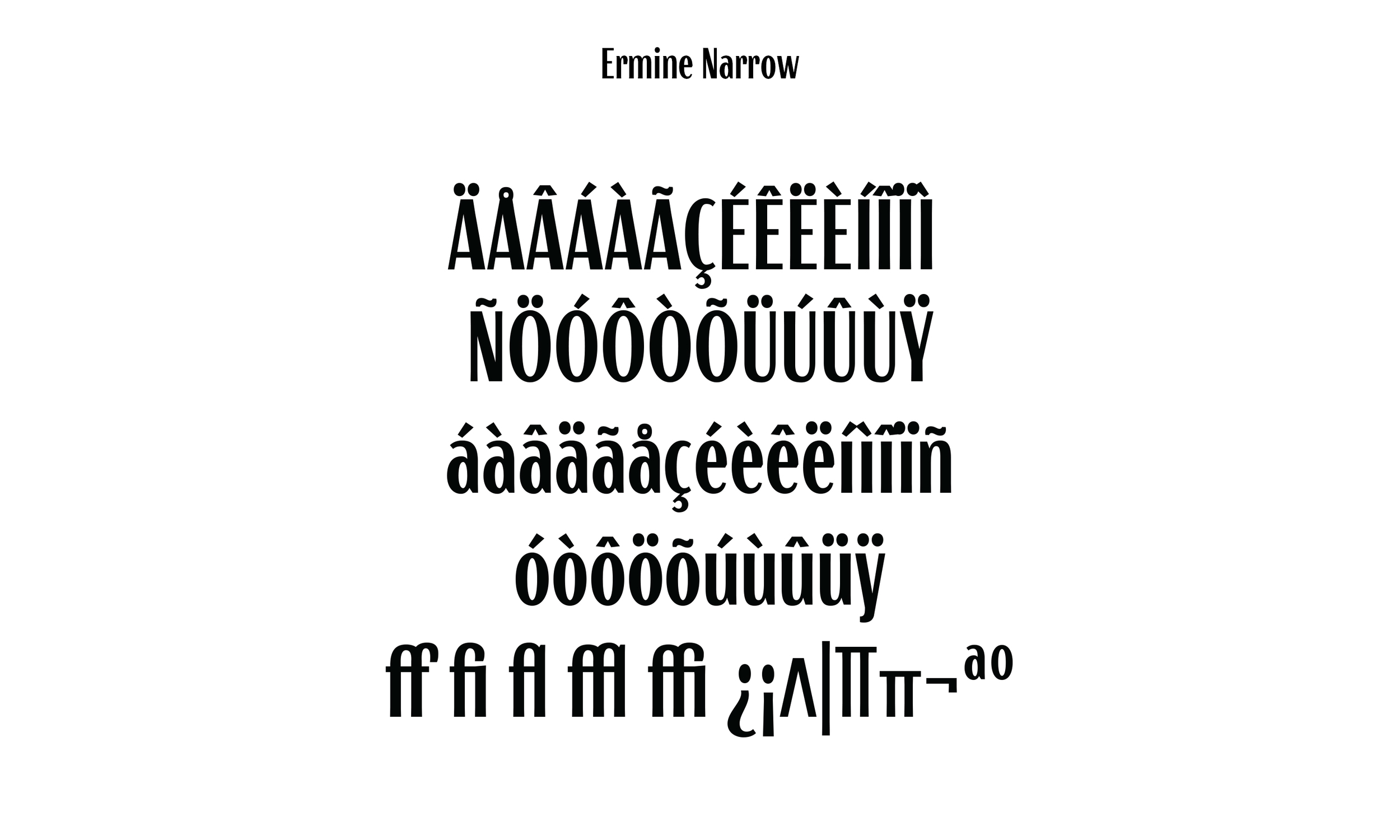
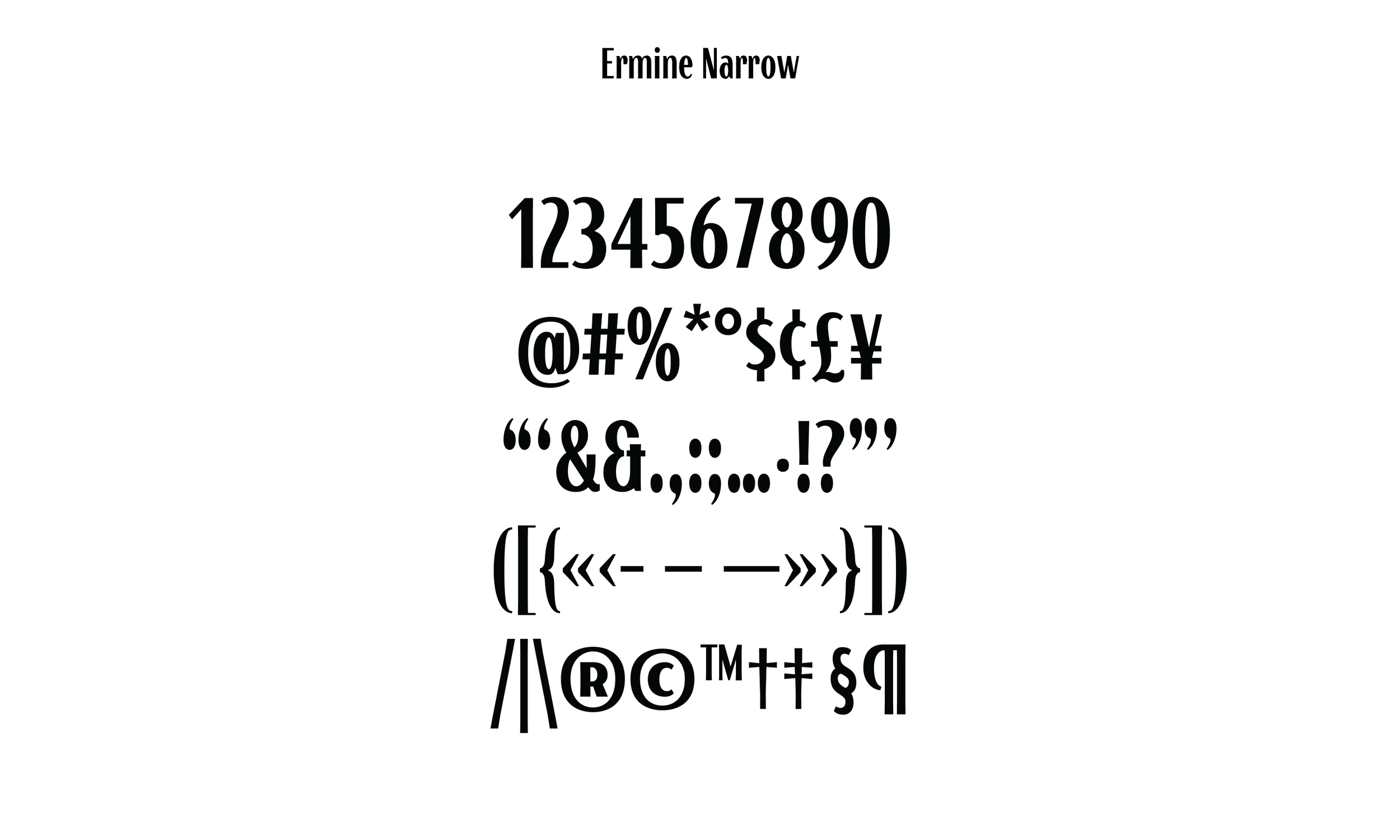
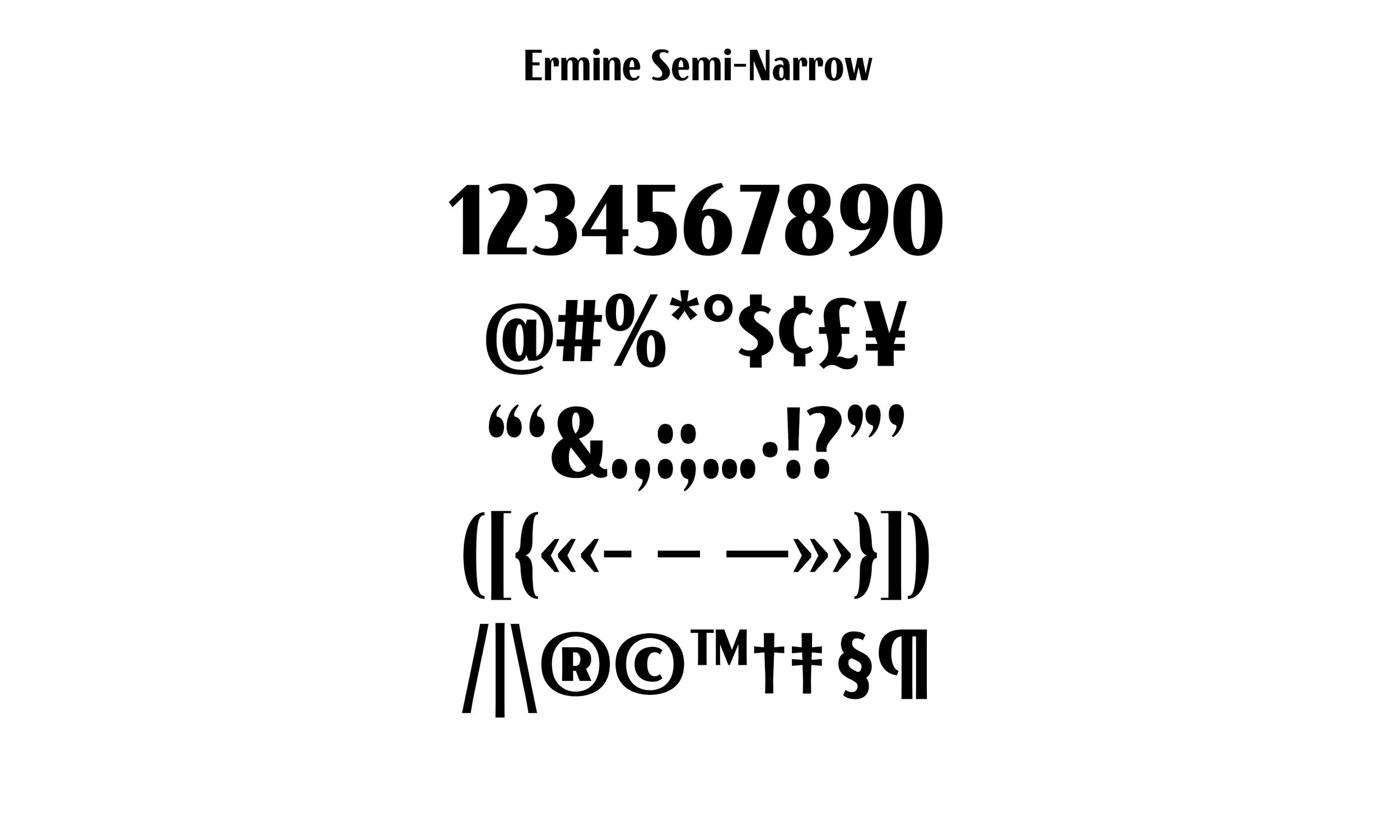
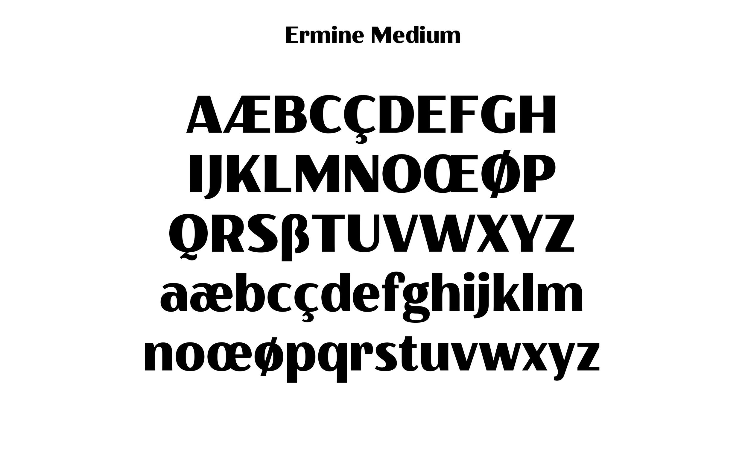
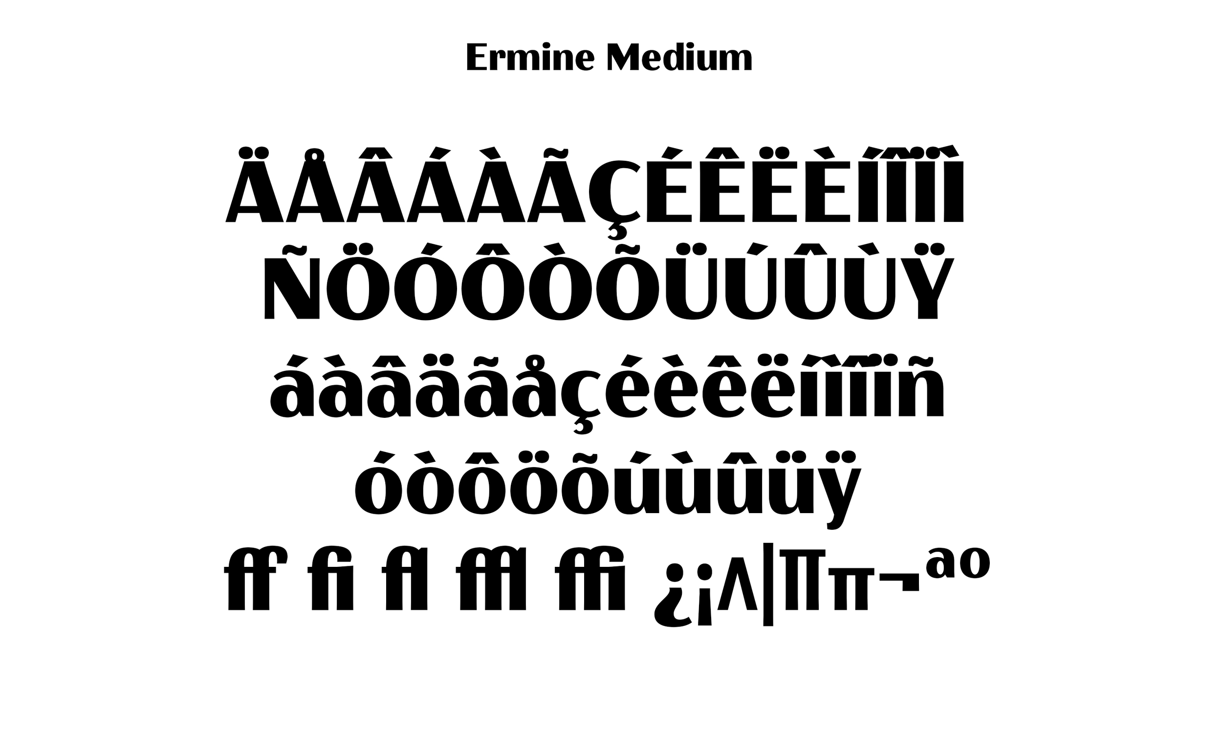
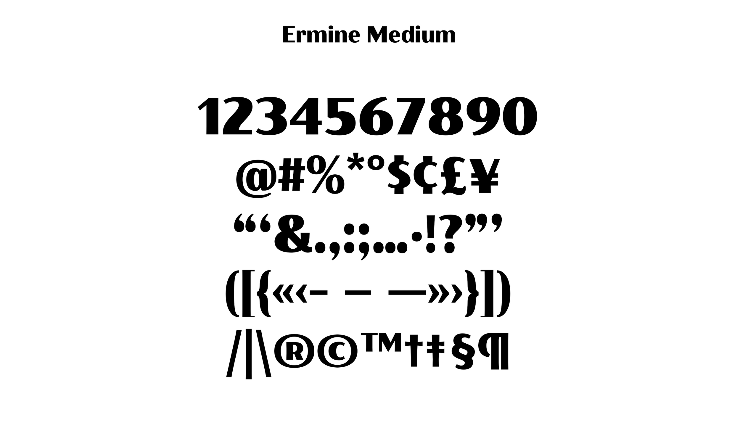
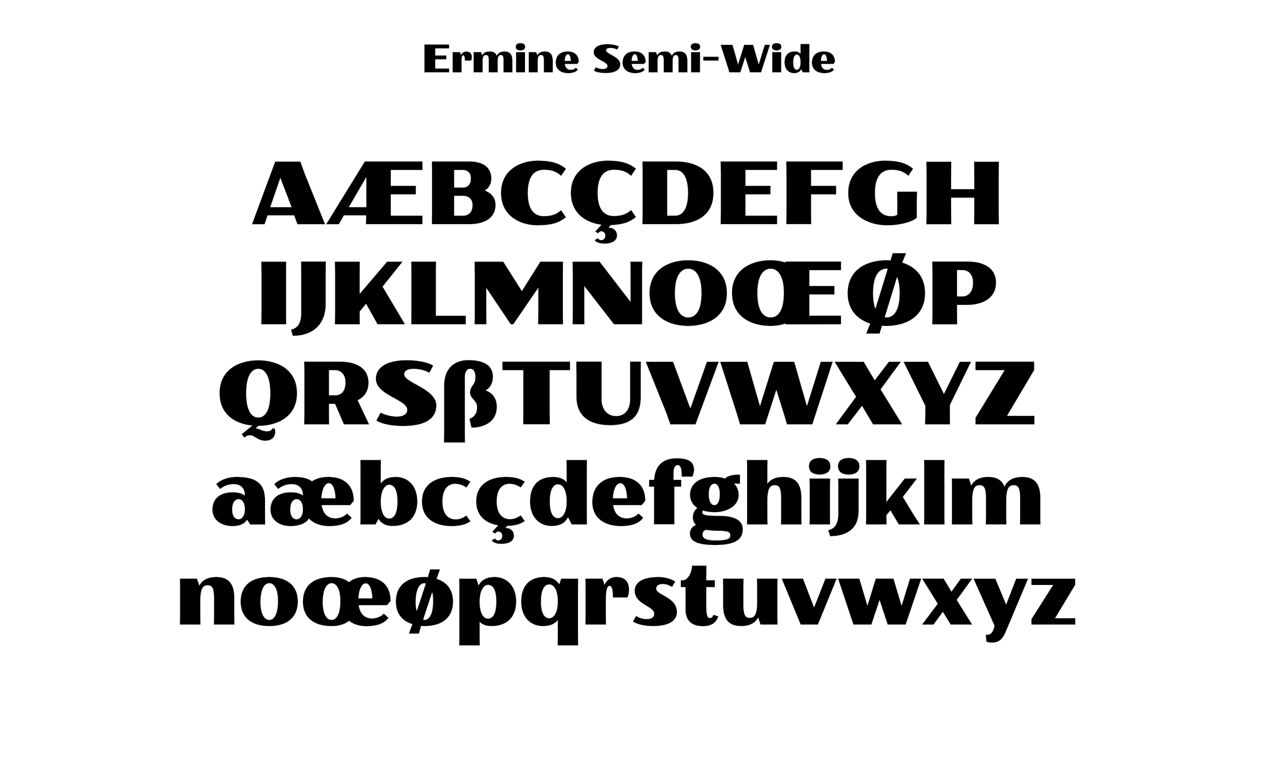
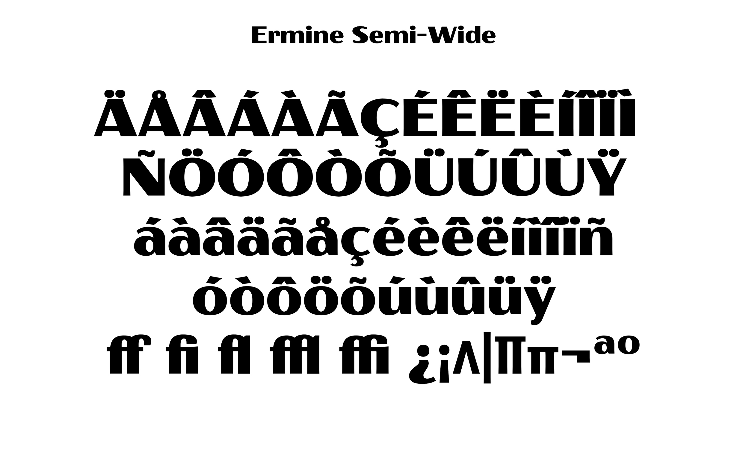
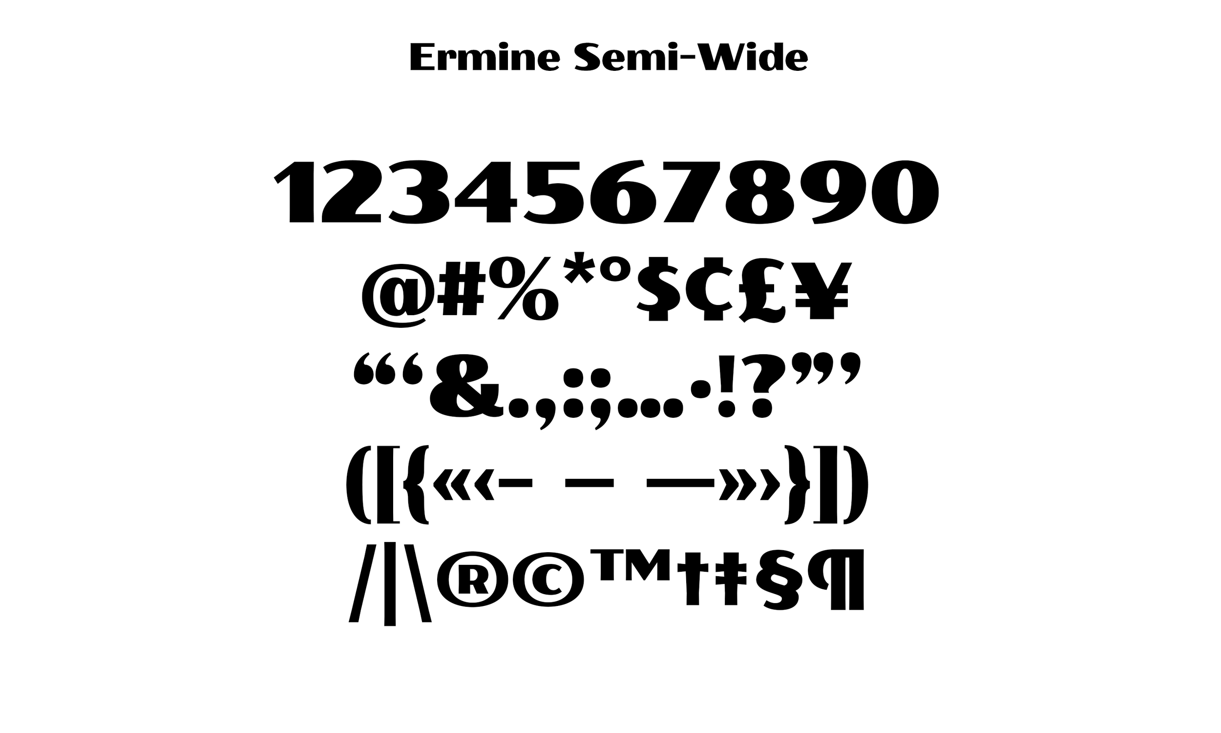
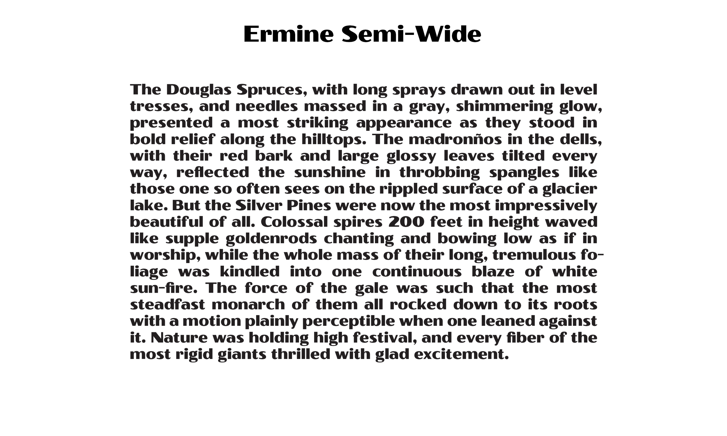
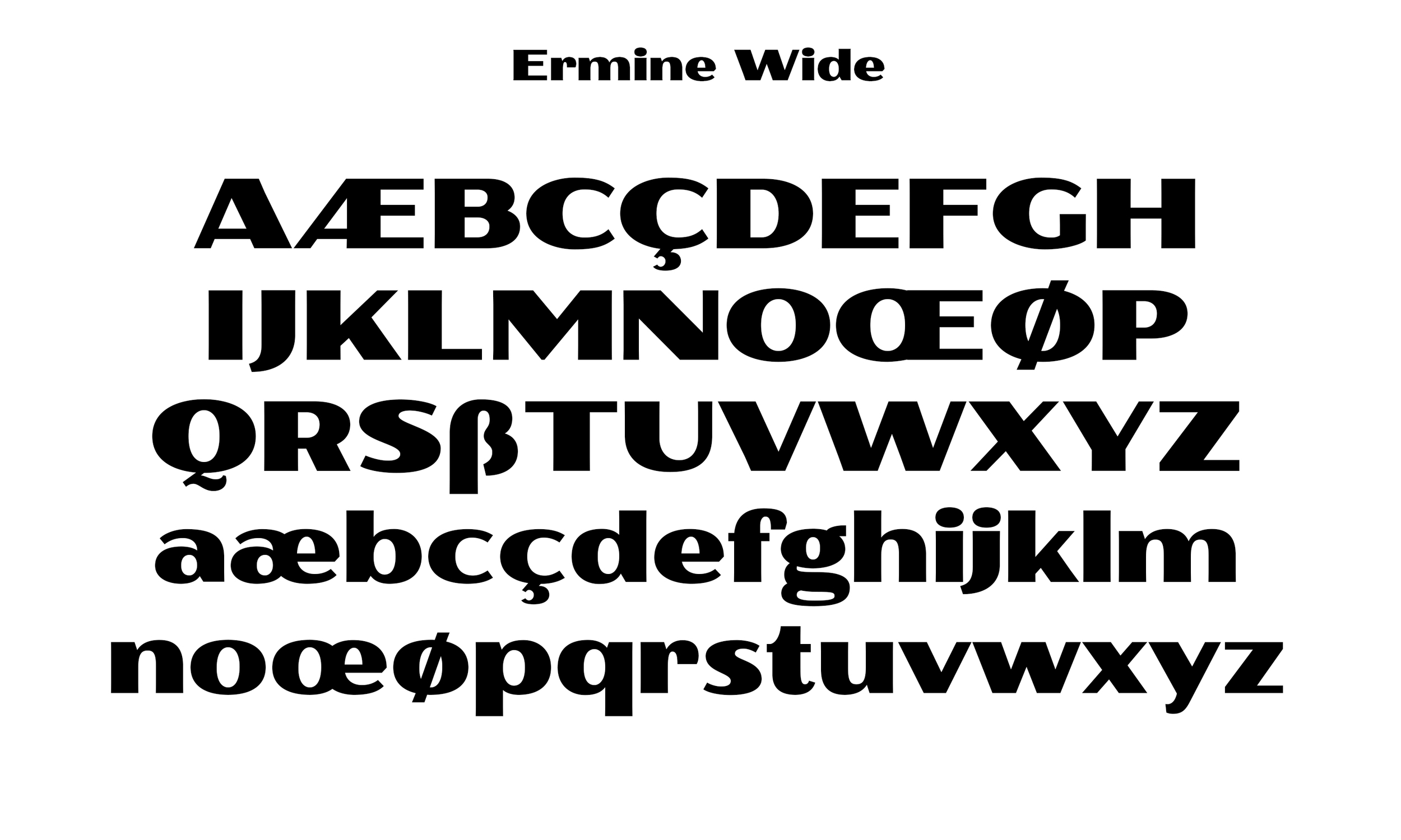
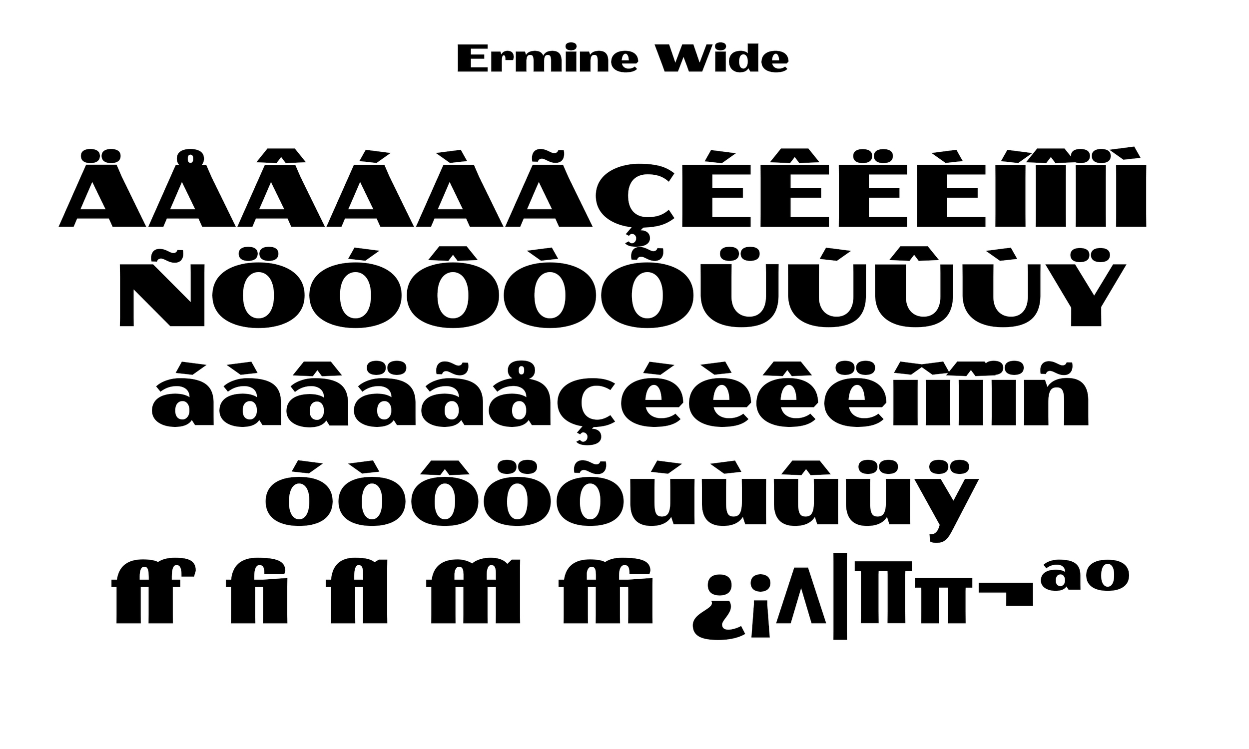
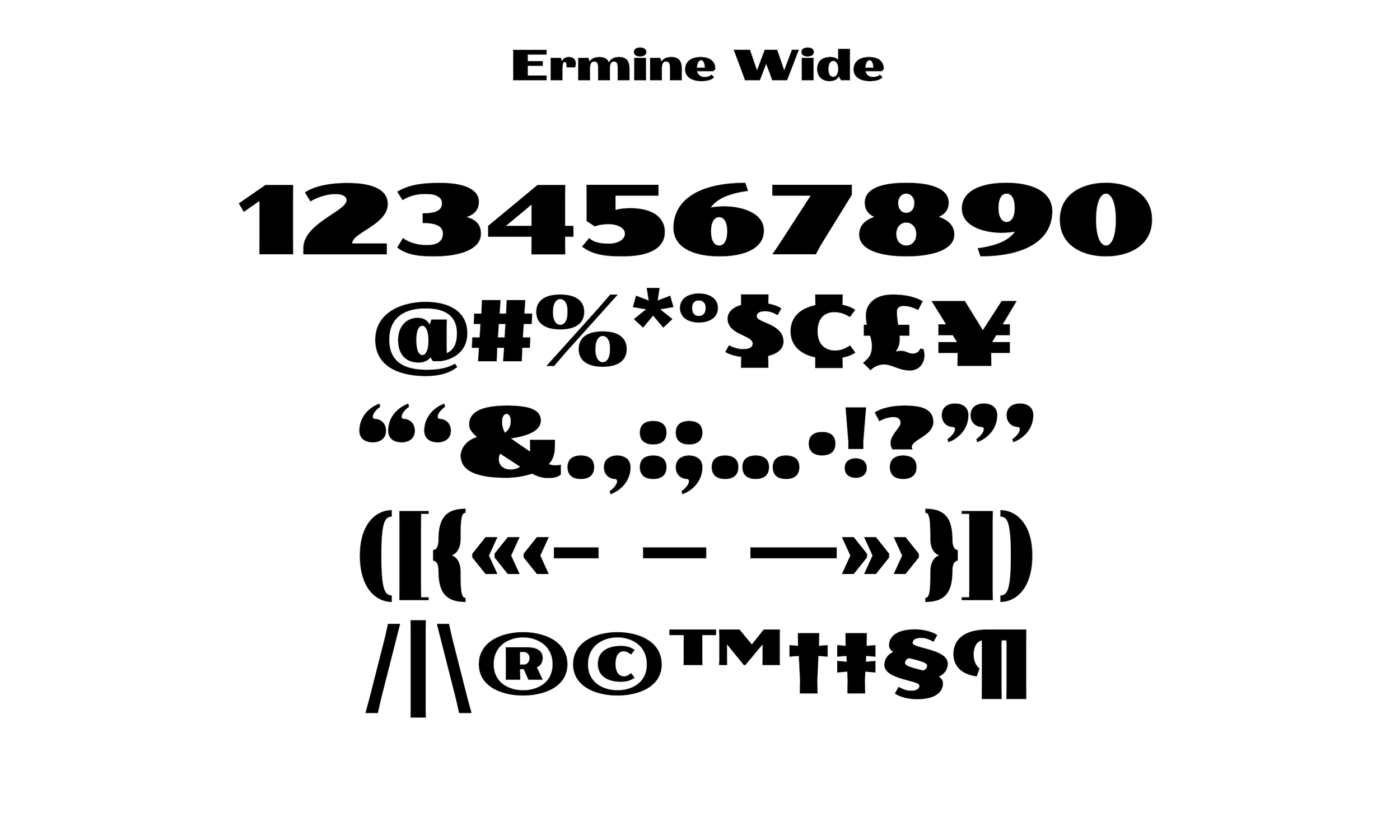
We have tried to infuse this spirit and style with the addition of a more sign-painterly brush hand into Ermine with 5 widths to match the wild National Park Service letters. Ermine is a great choice for headline and display functions, as well as editorial uses. Ermine comes with a complete Latin-2 Character Set and a selection of OpenType ligatures.
Individual Styles are only $30.
You can purchase the entire family for $125.
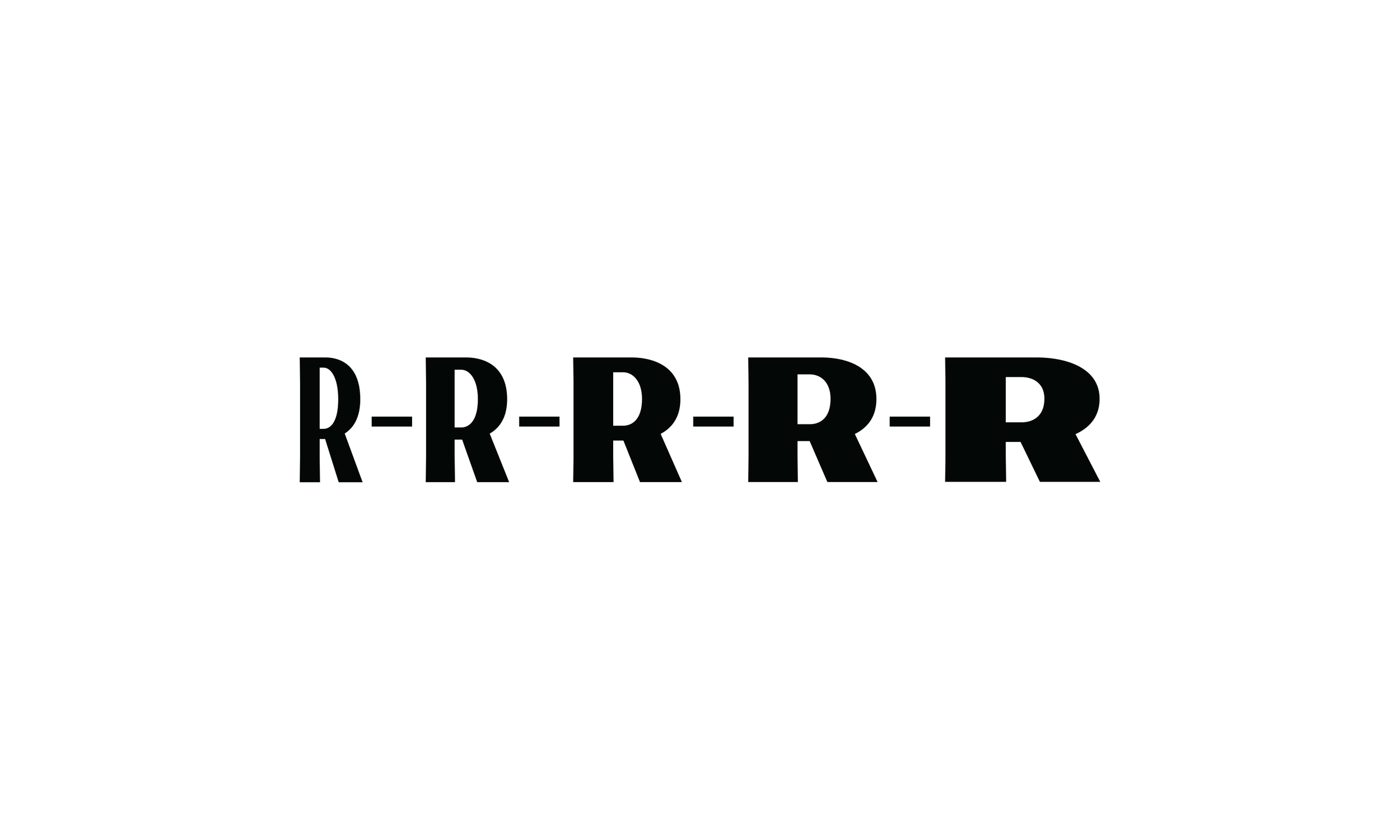
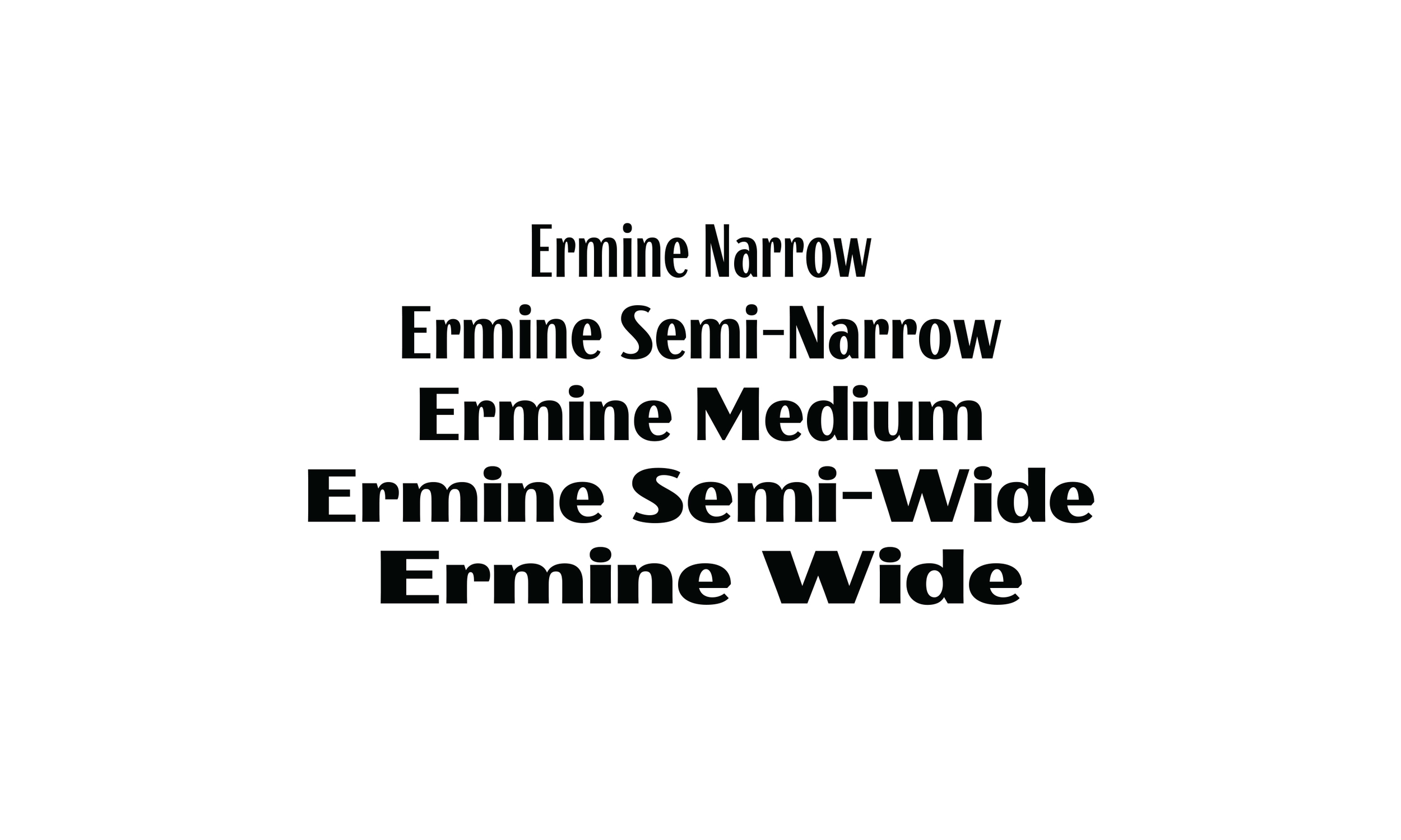
Ermine: A Family in 5 Widths
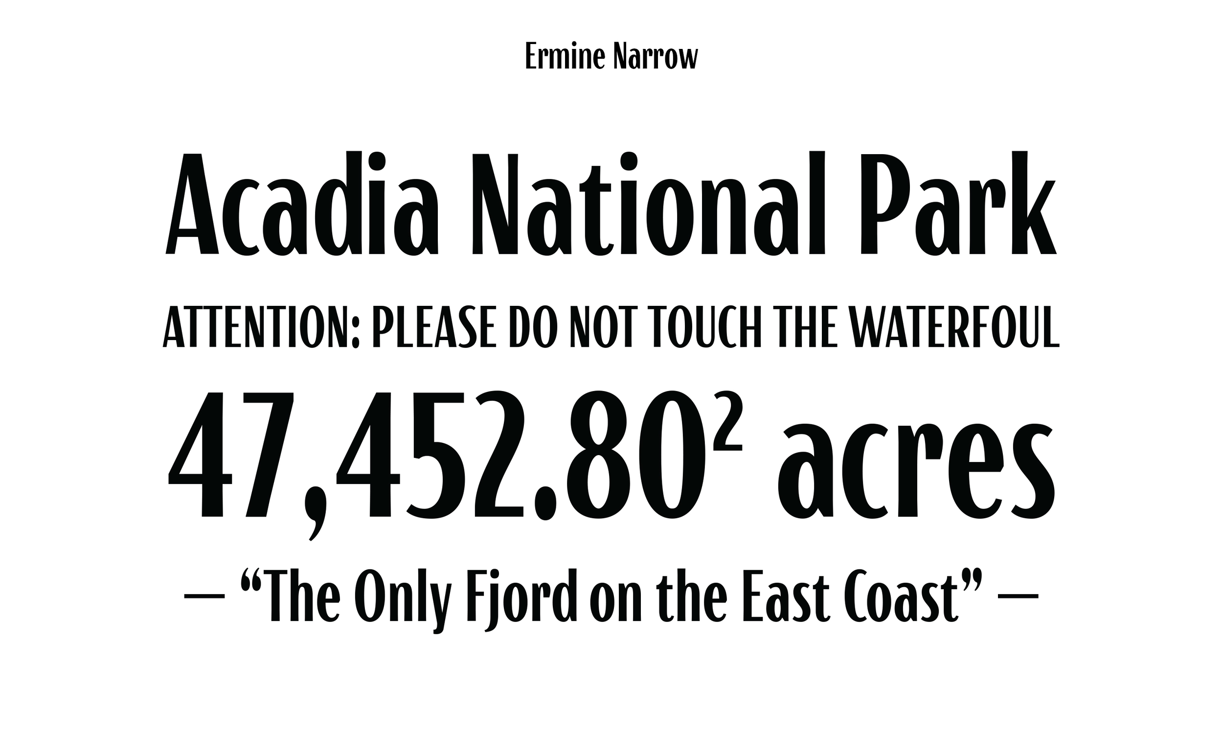
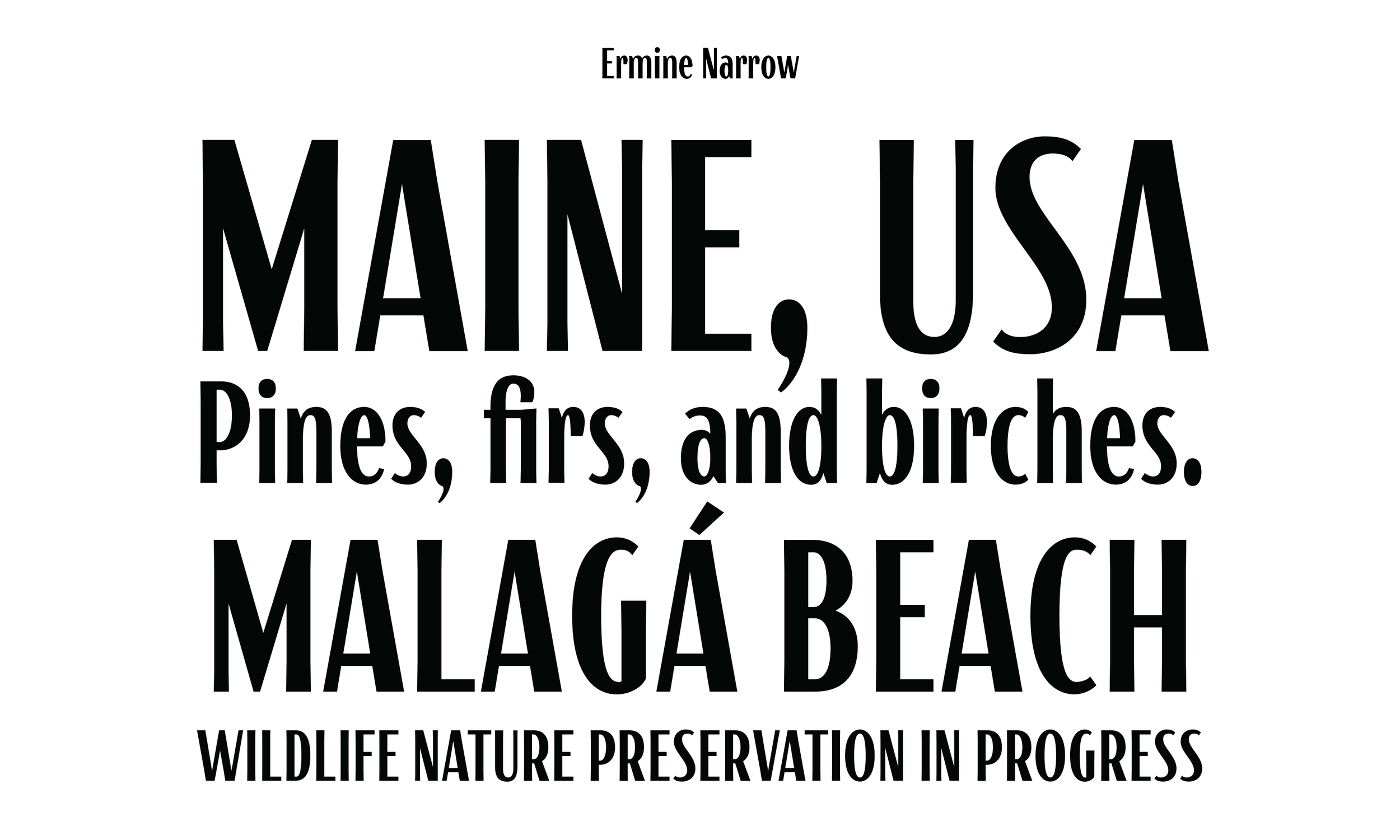
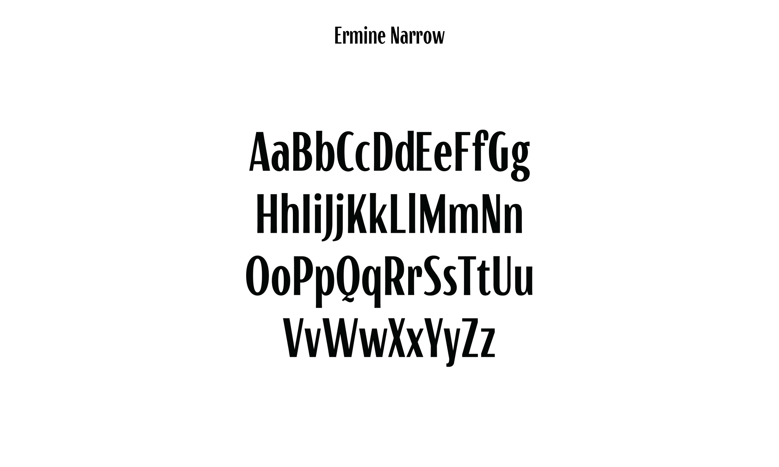
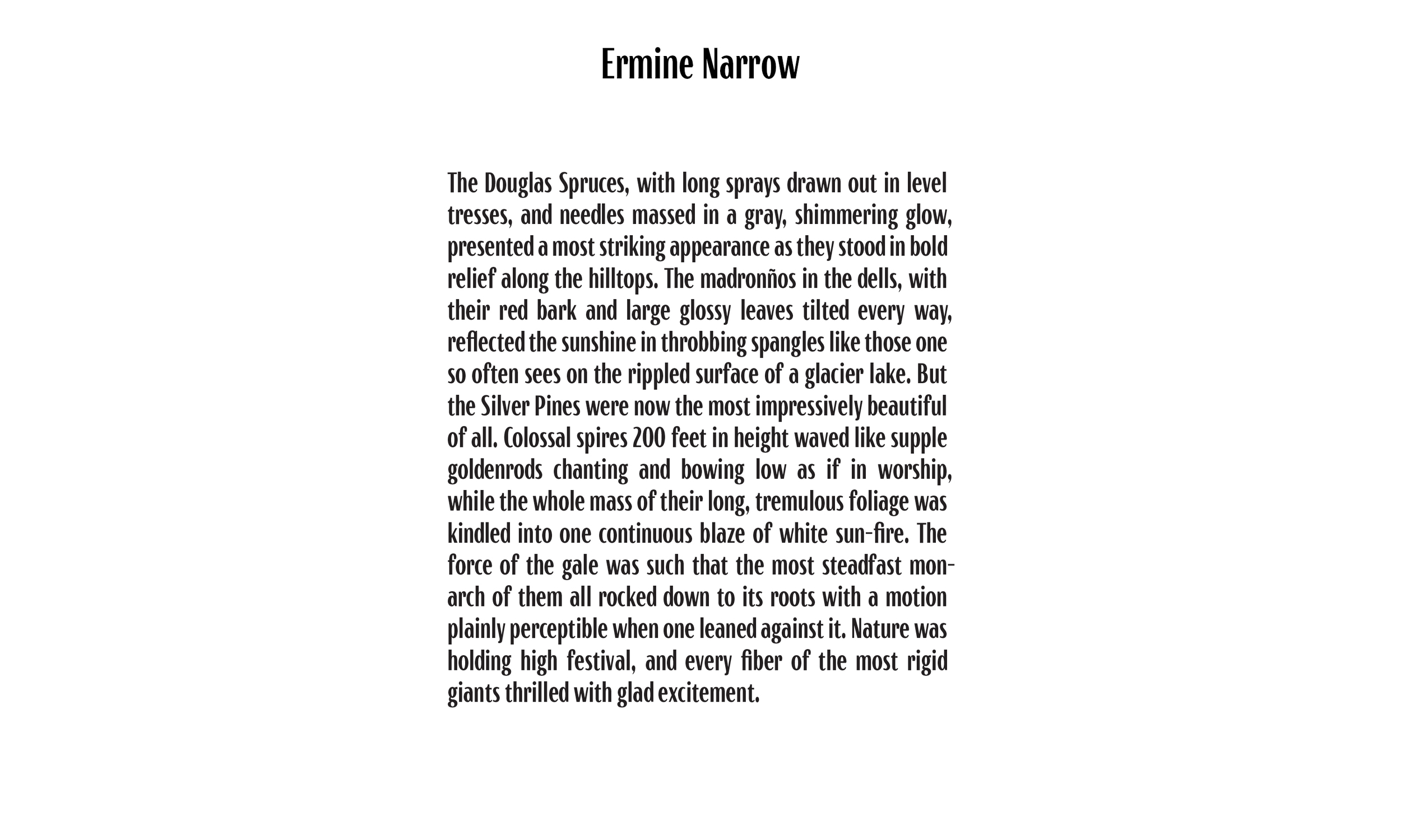

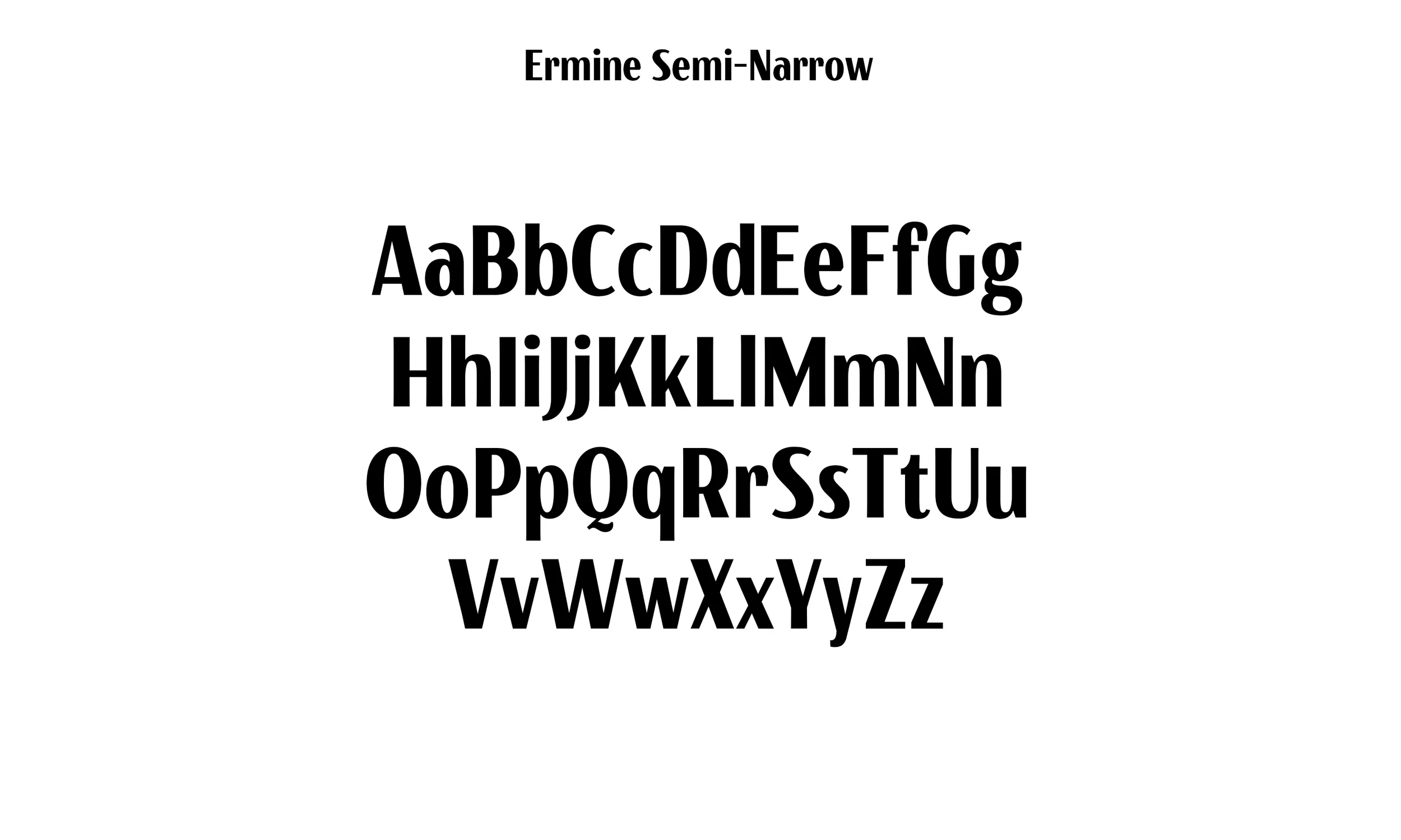
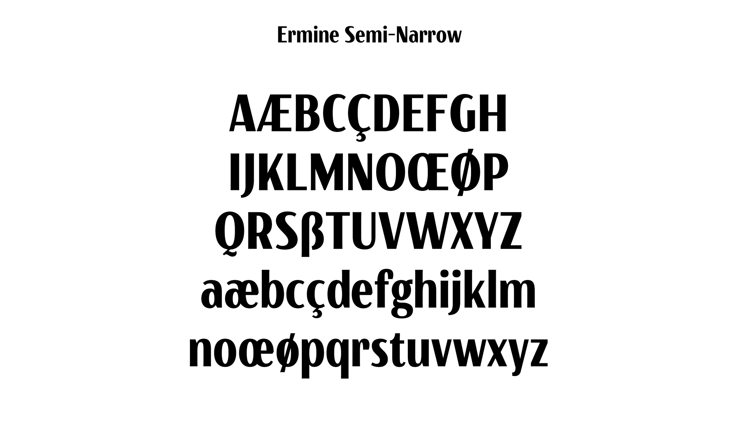
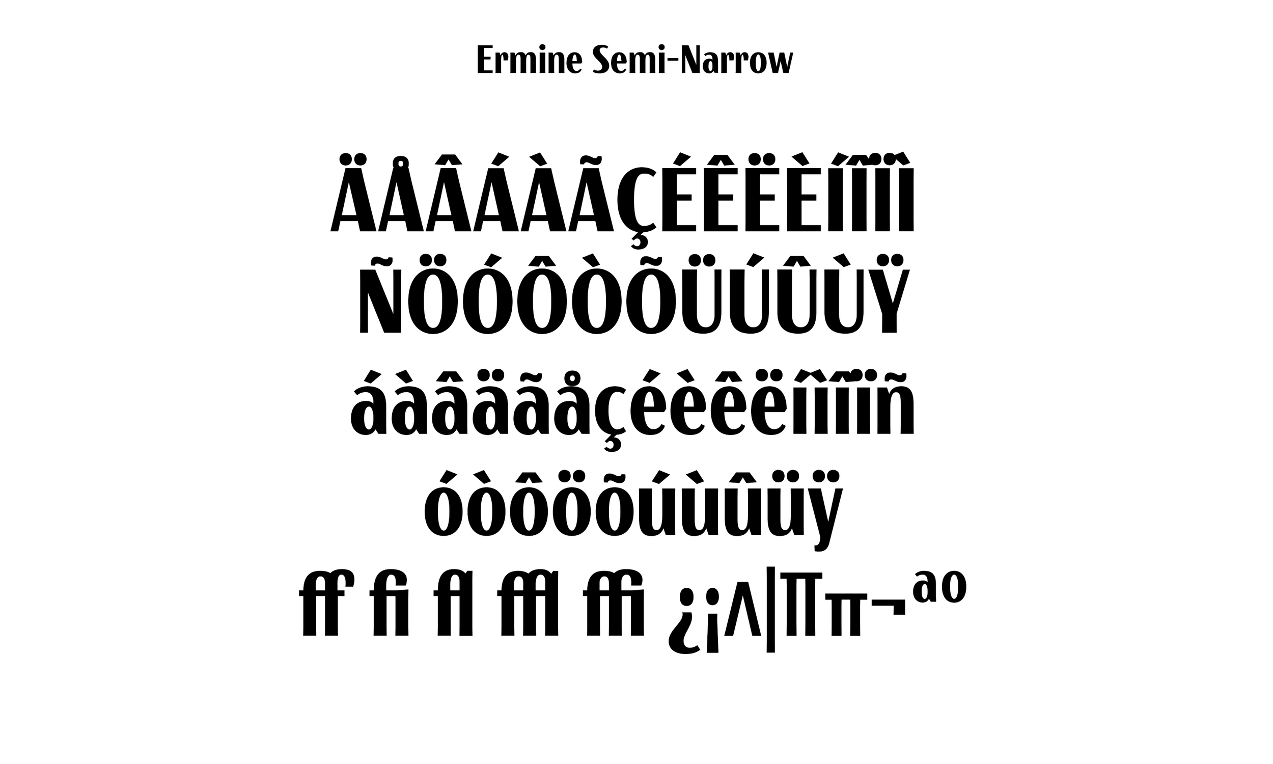
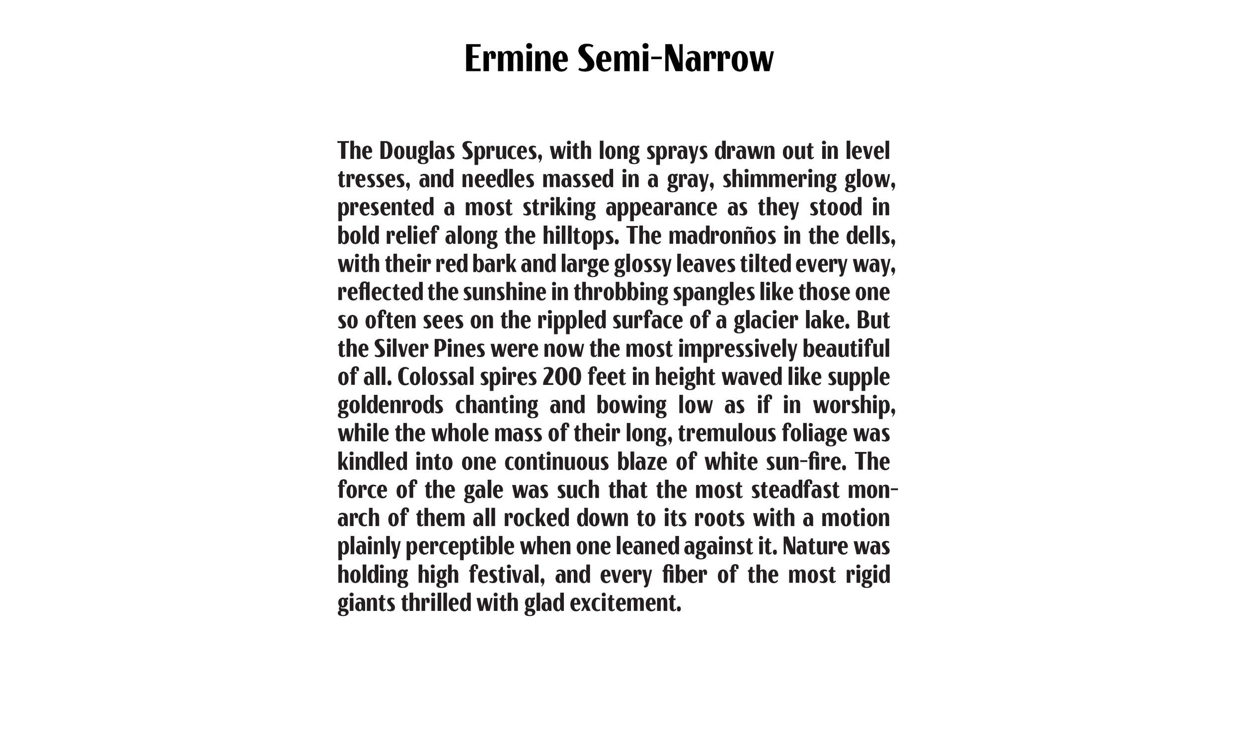
The Narrowest of the Ermine Family, inspired by the letters of the WPA. Great in banner headline settings and vertical layouts.
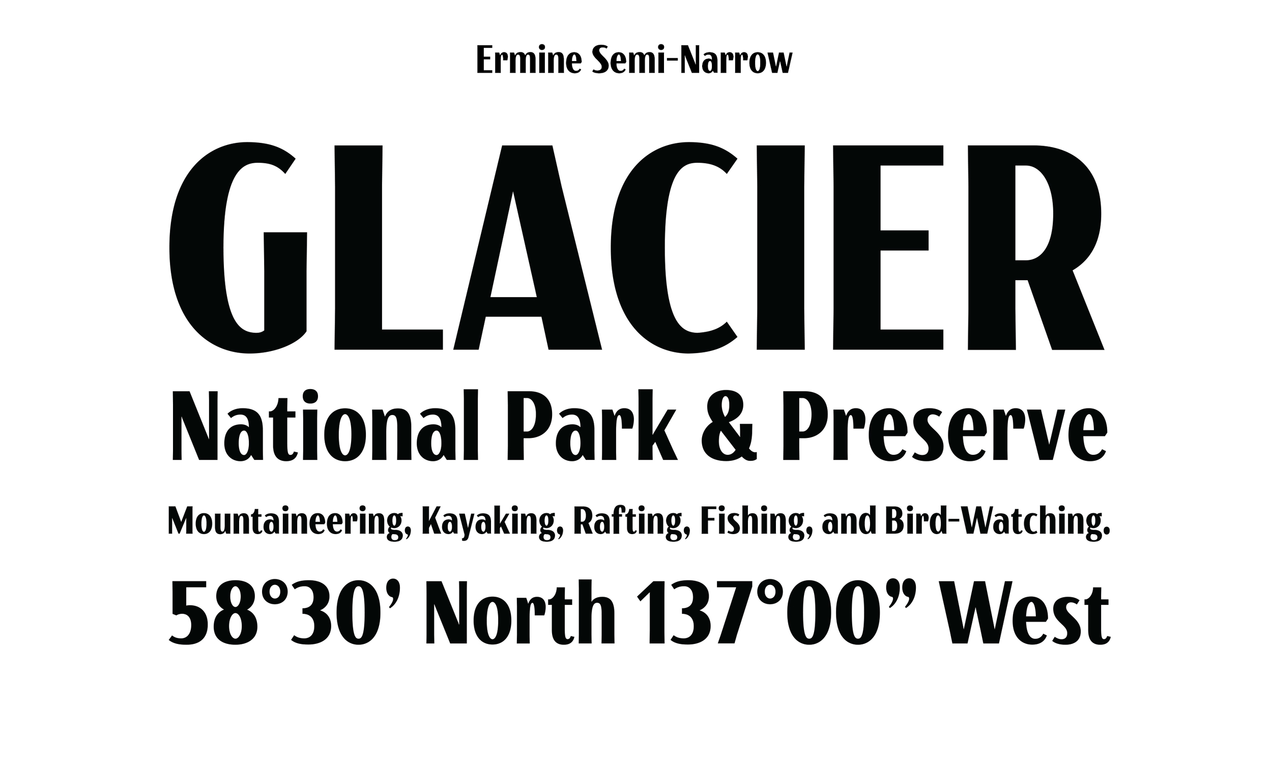
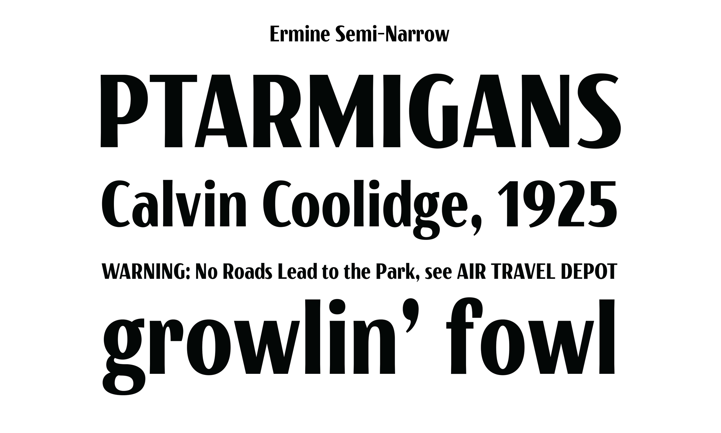

The second in line in the Ermine Family, inspired by the letters of the WPA. All Class, No Crass.
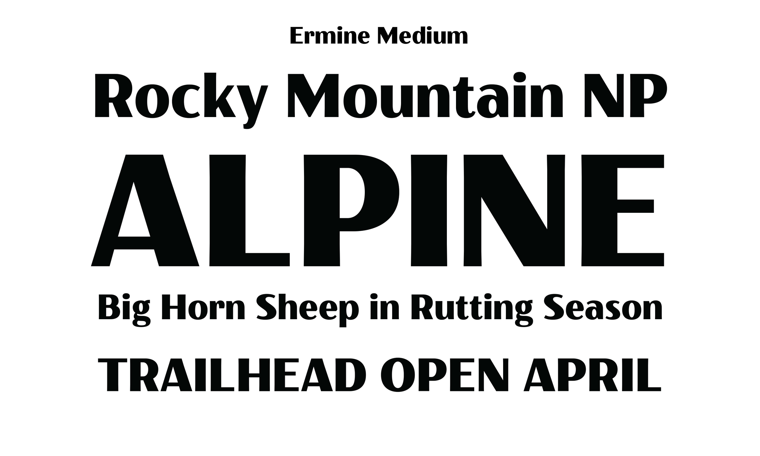
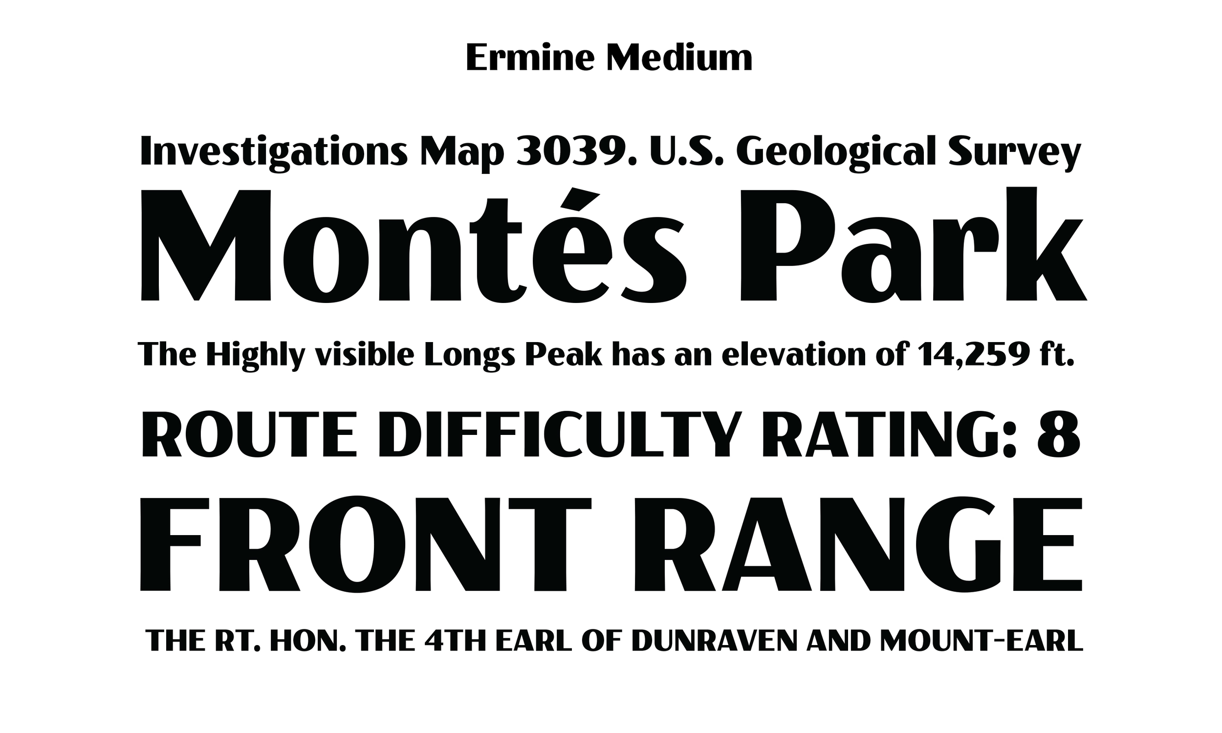
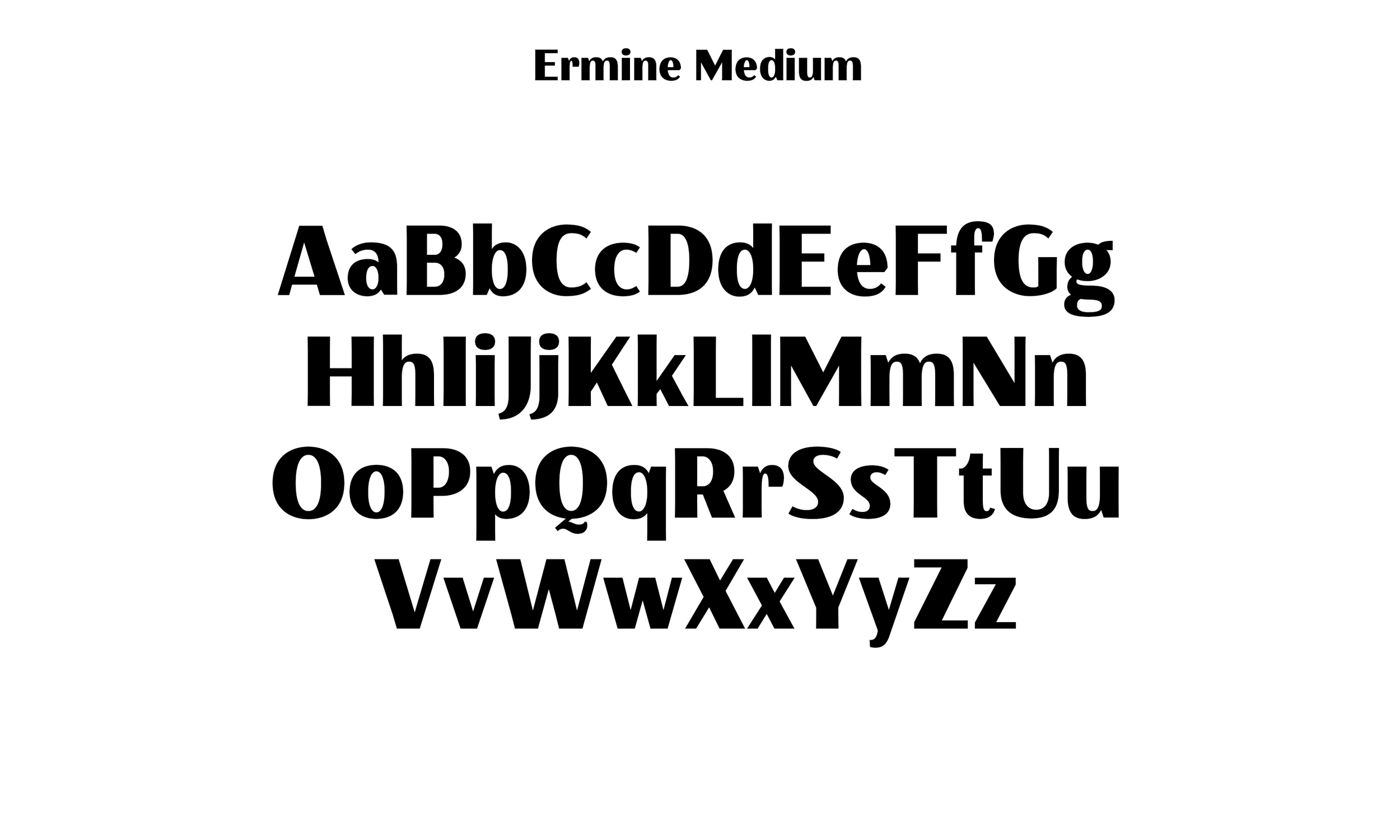
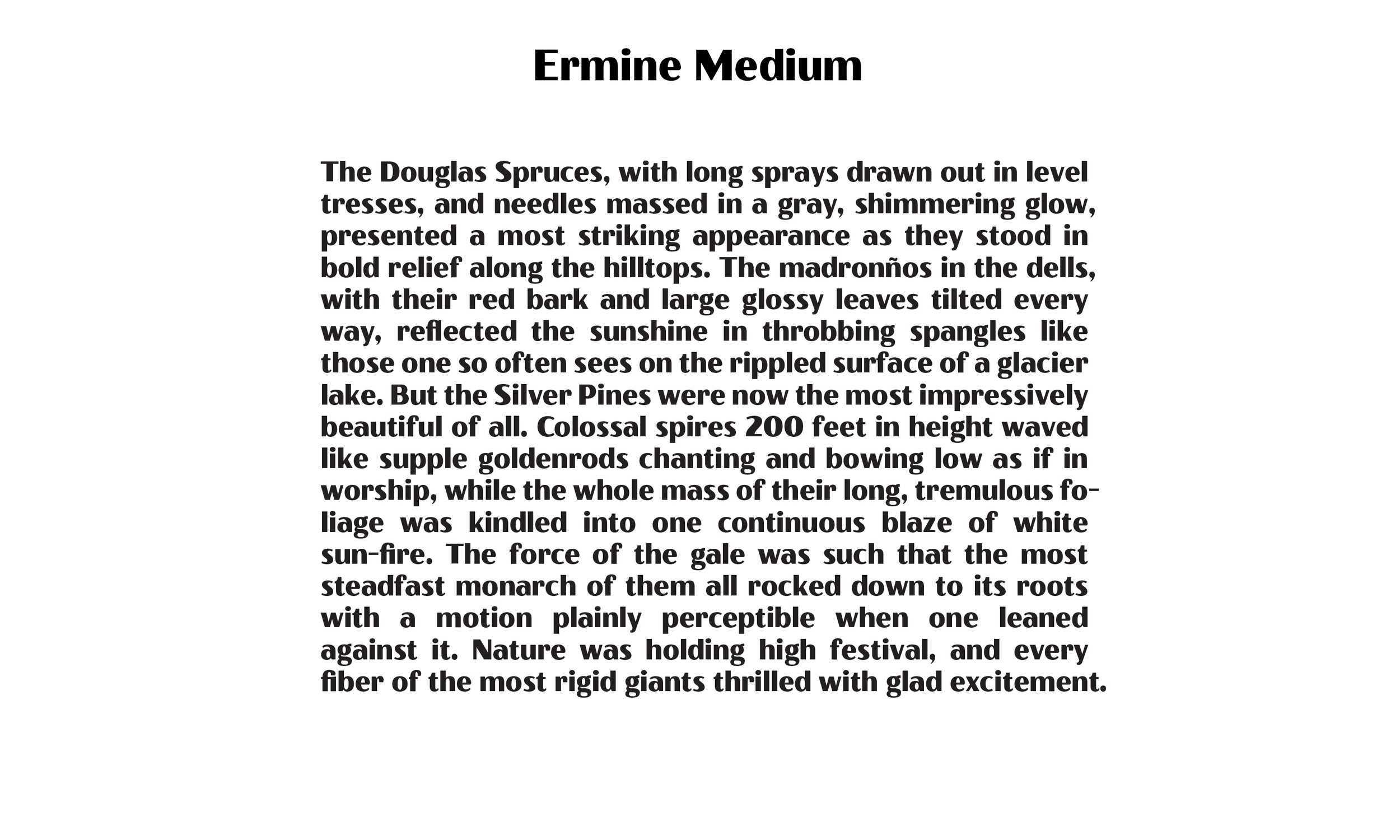

The middle weight in the Ermine Family, inspired by the letters of the WPA. A great go-to when you need a headline font with attitude.

The Fourth in line in the Ermine Family, inspired by the letters of the WPA. Solid, Sturdy, Won't let you down.
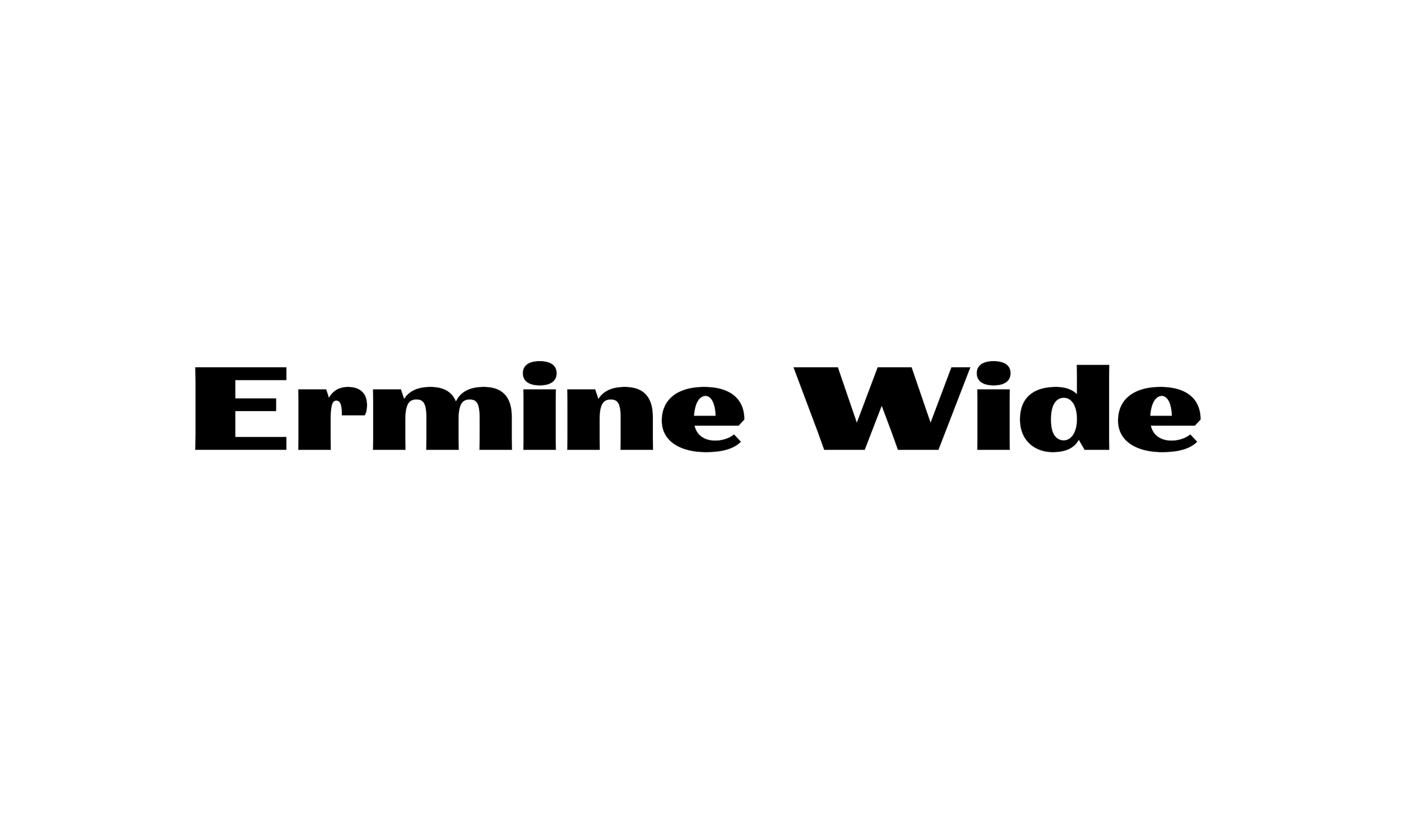
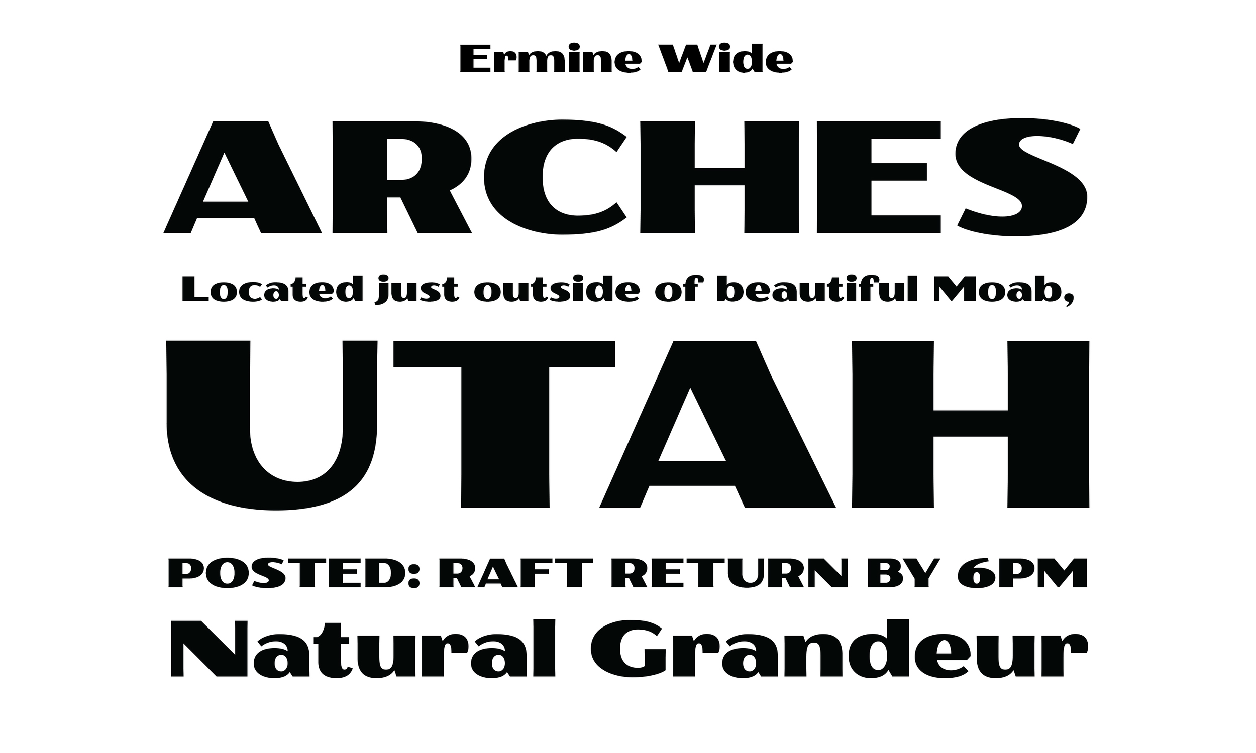
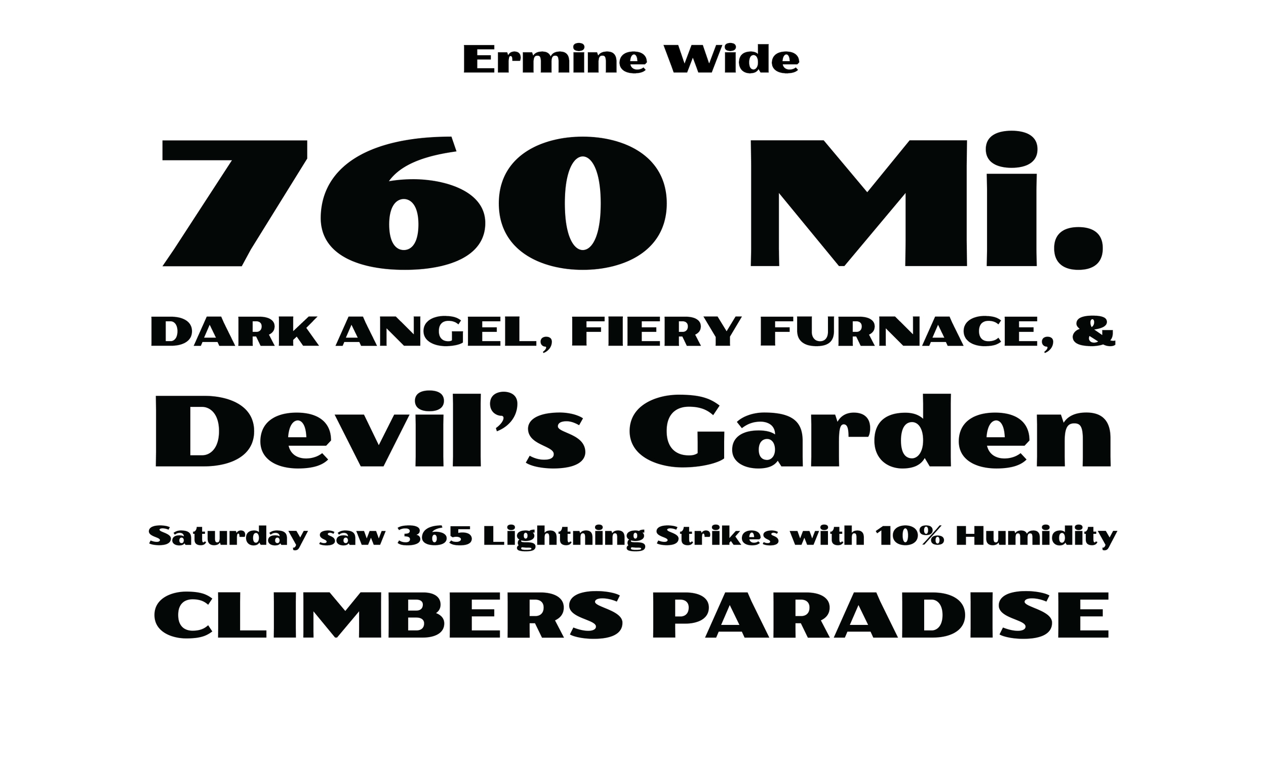
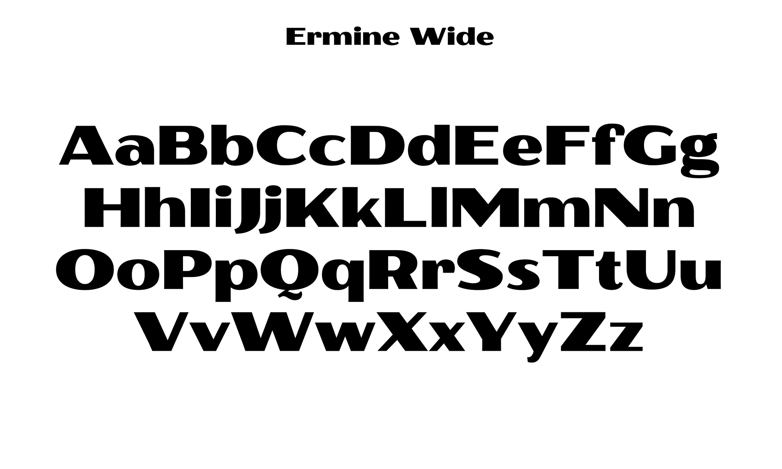
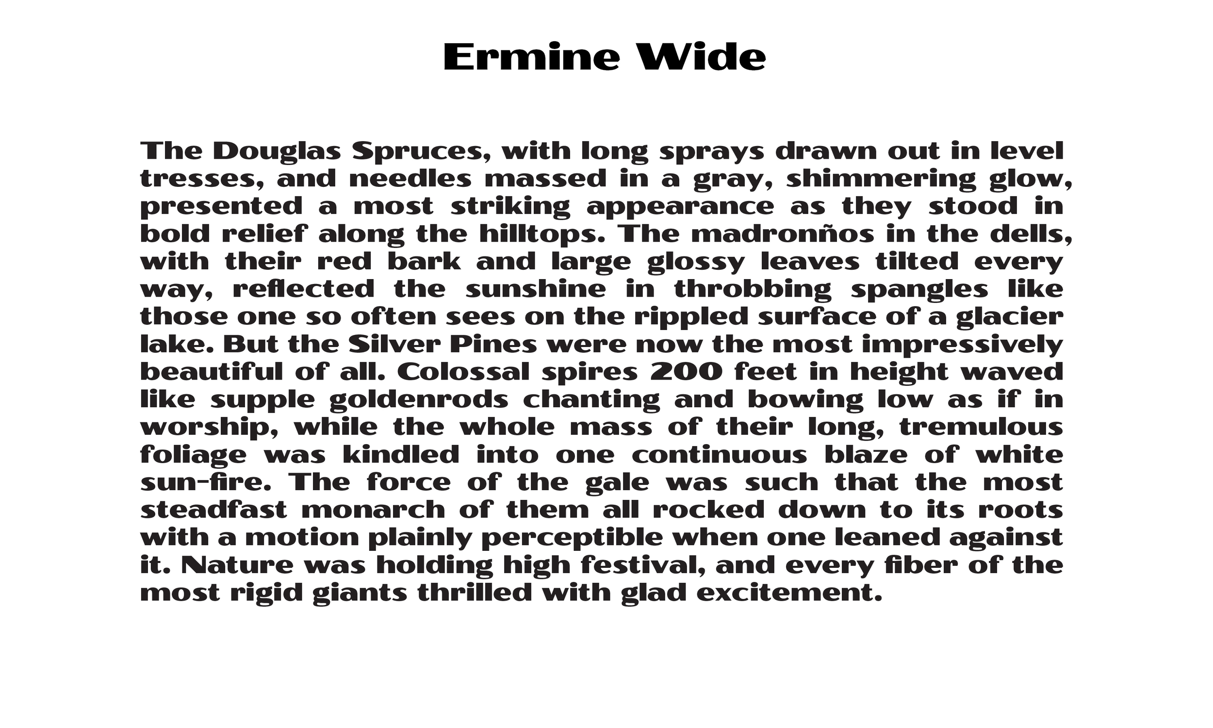

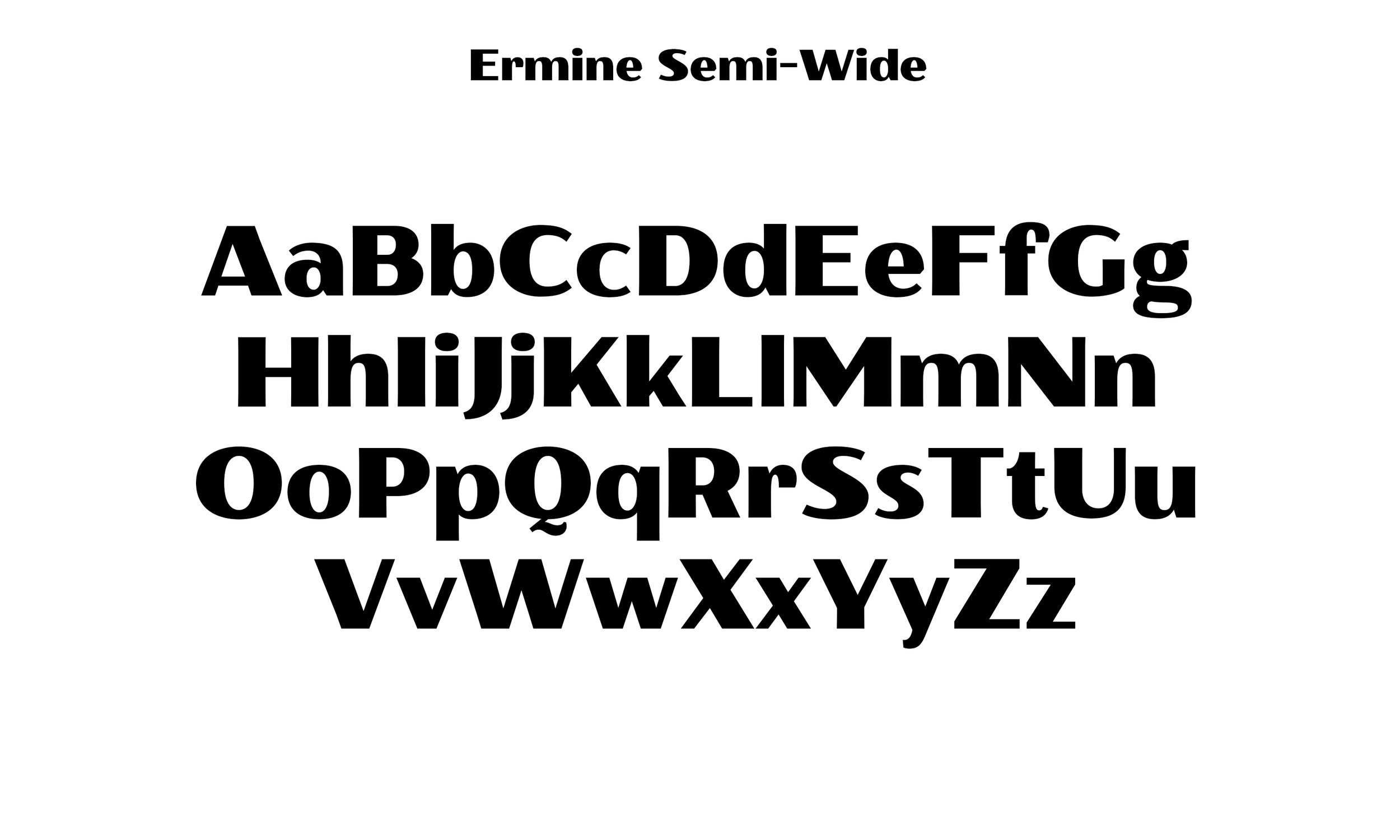
The Widest of the Ermine Family, inspired by the letters of the WPA. Best to let this guy have his way.
Bundle the Entire Ermine Family
Just have to have the full family? Nice.
Buy the full Ermine Family Collection at once and save a few dollars.

The Complete Ermine Family, inspired by the letters of the WPA. Use them separately, or in concert, but for a real authentic look, why don't you try mixing and matching every character... Wacky.