
THIS WEEK FROM THE DESK

Briefcase Type released a new sans this week: BC Novatica. It's a handsome sans of generous proportions and minute digital details. It features a few rather radical letterforms like the lowercase n alternates. Check out the full face on their site here!


Thomas Jockin has started publishing a little video series he calls "Fontributes" focused on typography-related curiosities posted with accompanying Medium articles. Its really more of a visual podcast. This one on The Role of Lowercase in Typefaces is a good start.
Scott Dadich's Makin' Moves, and Movies.
Famed design editor writer and figurehead Scott Dadich made news recently for leaving Wired completely to pursue new projects. Well, It didn't take him long thereafter to announce that he was starting a firm...

...And if that wasn't enough, he dropped this news-bomb this week; he's got a show premiering on Netflix in February about profiles in design. He, along with a full Wired crew, pulled together some very good names to evaluate the state and power of design. Yes please. Watch the trailer for the show above.
Mark Simonson Joins TypeNetwork
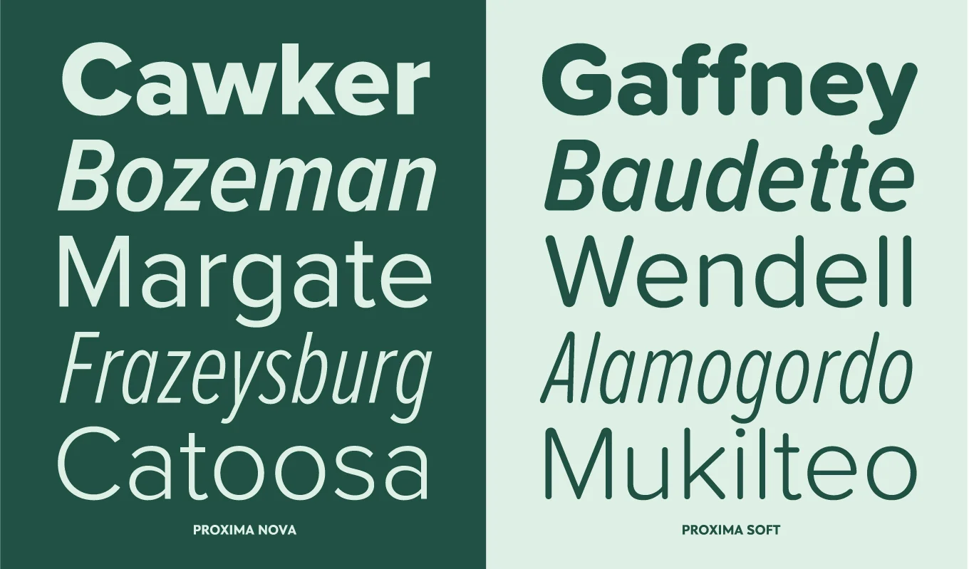
The legendary Mark Simonson has joined the growing community of independent foundries, presenting his entire library of fonts from the prolific Proxima Nova to his more character-packed lesser known fonts. This is a good get for Type Network.

The lauded and exquisite Ikko Tanaka (1930-2002) would have turned 87 over the weekend, and it's been noticed in the design world. I think Tanaka's work has been having a little more resurgence in the past few years as it was so far ahead of its time to begin with. AIGA's Eye on Design took a moment to recognize the designer's work with this post of poster pick by Steven Heller. There are a lot of go-to examples of Tanaka's work out there, but this book poster is a studio favorite.

"In a landmark decision announced in Tokyo yesterday the Japan Sanitary Equipment Industry Association – a consortium of nine major plumbing manufacturers that includes Toto, Panasonic and Toshiba – agreed to standardise the iconography used on control panels for toilets."
I'm all for clearer iconography, I think this is a pretty good, and entertaining, move. Thanks for the lighthearted pick-me-up news story! via It's Nice That.
Release: Kinetic Type by NM Type

NM Type, also known as María Ramos and Noel Pretorius, released a very handsome sans geared towards the art world. It seems like 'just another sans' at first but with a closer look it quickly becomes clear that this is much more than that. It showcases some original character design, and looks as though it was designed with multi-media in mind. Plus, the mini-site makes for a very well made presentation. Visit Kinetic Type.
